 Alexander Reelsen
Visualizing German Vaccination Data Using Kibana Lens & TSVB
TLDR; This blog post shows how to import a tsv file using the file visualizer and how to visualize data that is not shown the same way on the German impfdashboard.de website.
I tend to watch the German vaccination status page daily - as a sign of hope and progress. There are a couple of community ones and also the official one named Impfdashboard.de.
There was however one graphic that I don’t like and it’s the one how the vaccinations are split between vaccination centers and local doctors - because it does not show the insane amount of work, that the doctors are doing.
It’s this one:
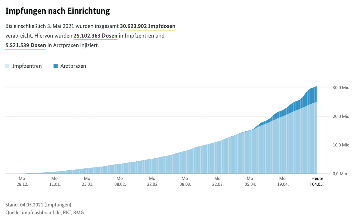
You can hover with the mouse over each bucket and see the amount of vaccinations done, but also have to subtract those from the previous bucket. Let’s fix this via the Elastic Stack.
First we need to get the data. However when using the inspector and check the files being downloaded when loading the Impfdashboard you will see something like this
https://impfdashboard.de/data/germany_vaccinations_timeseries_v2.2971491f.tsv
Note: I have not verified if the URL to the TSV files change everyday, so maybe you need to adapt this URL to get the latest data.
You can just retrieve via browser or curl and store this locally. Upon
inspecting this, this file lives up to its name and really is a tab
separated value file, also containing a header line. Let’s go with Kibana’s
file visualizer and import this file. You can find this by clicking Machine Learning and then the Data Visualizer in the tab navigation. Click on
Import data and select your file:
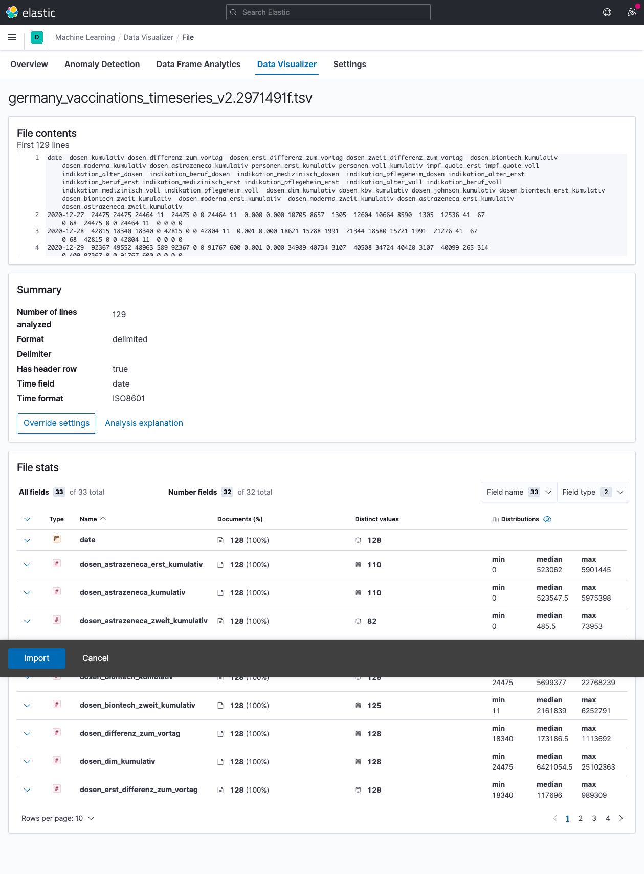
Good news! Everything has been detected properly and we can go ahead and import the data (don’t worry about the weird position of the import button, this was due to my screen shot tool).
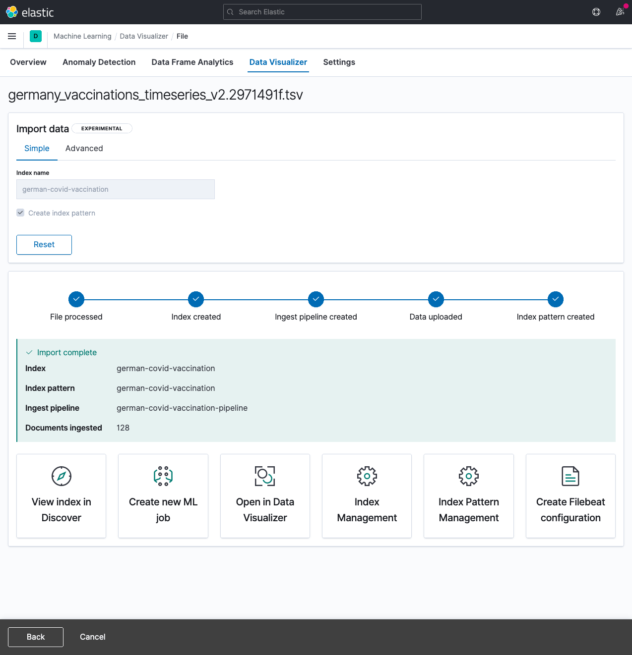
After clicking import you need to name an index - I got creative and picked
german-covid-vaccination.
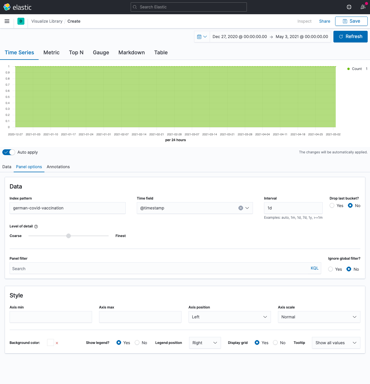
Let’s try a couple of different things. Go to Analytics > Visualize Library and click on Create visualization, select TSVB.
You now have an empty chart like this:
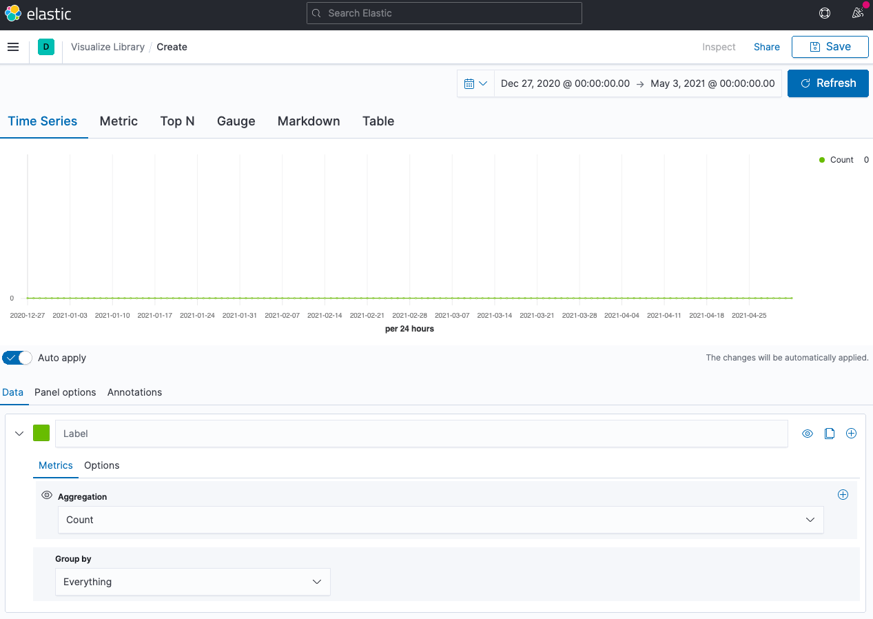
Go to Panel options and set the index name to german-covid-vaccination,
the time field to @timestamp and the interval to 1d, as we only have a
single data point per day, and do not drop the last bucket. Your graph will
now look like this:
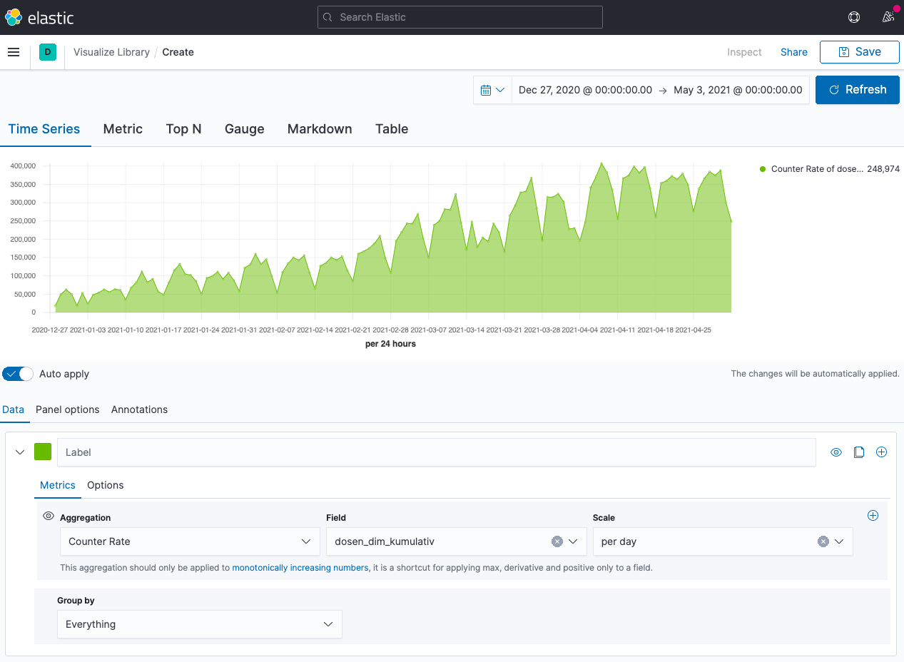
Now, let’s add some data. Select Counter rate for the aggregation, use
field dosen_dim_kumulativ. You will end up with an image like this for the
vaccinations done in vaccination centers:
Time to add the vaccinations by doctors. Add a new series, specify Counter Rate again, but this time use dosen_kbv_kumulativ as a field. Also pick a
fancy color and optionally add some labels
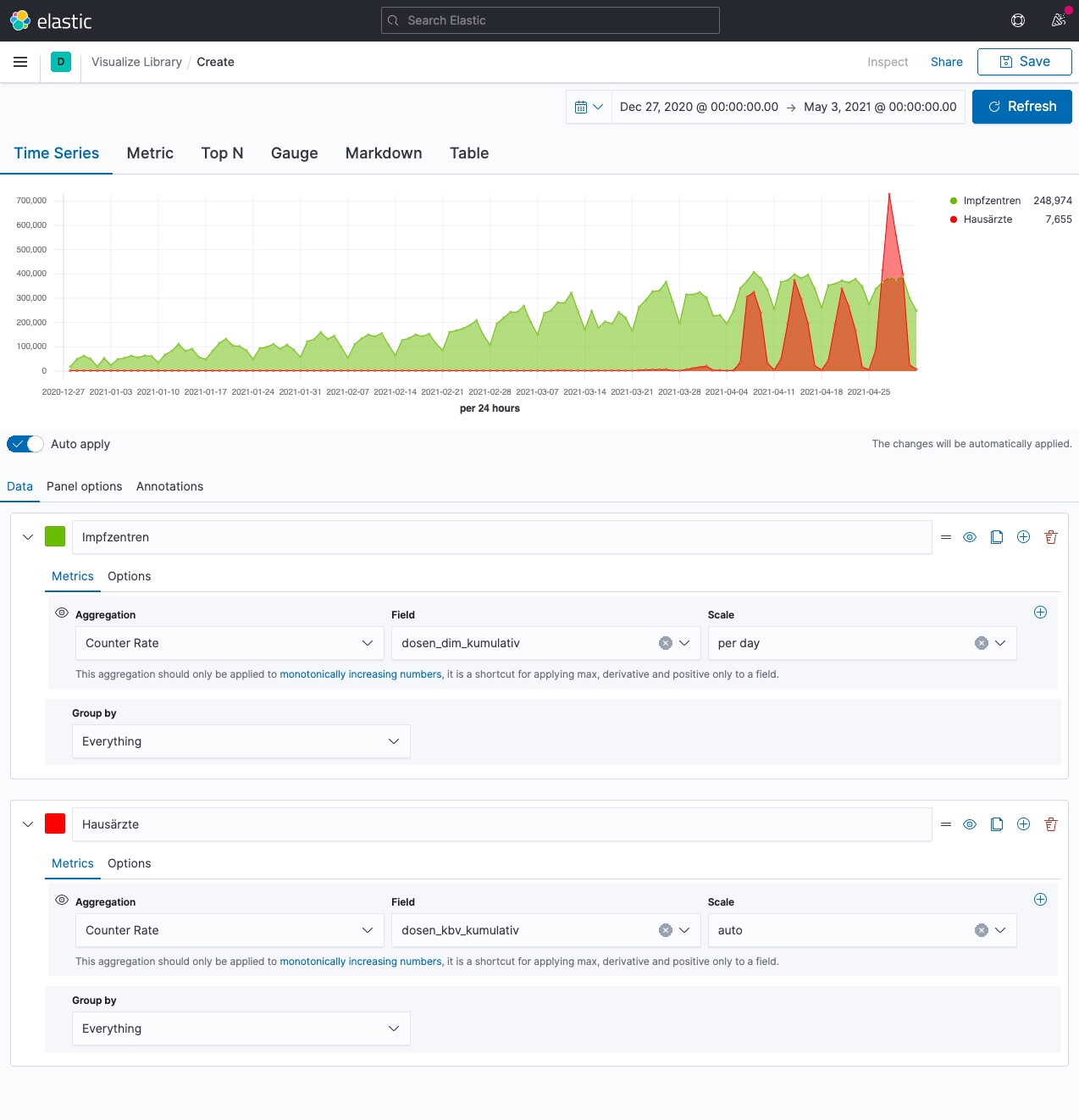
What a surprise. The doctors have been surpassing the vaccination centers by a vast amount last week - which is absolutely impressive given the vaccination centers pretty much have only a single task to do 😀.
So, we know now, we can display the visualization we want - but we’re not done yet. You probably have heard already about Lens, which had been introduced into Kibana late 2019. Over the last months it has gotten tremendous attention, so that you can even cover the above use-case easily with lens. Let’s try to create the same visualization using Lens.
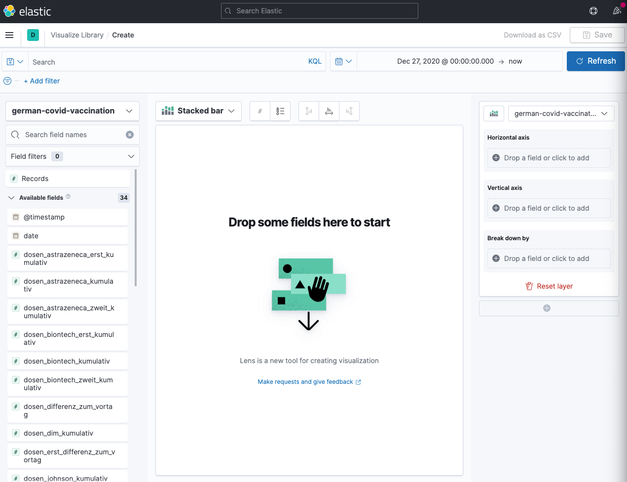
So, create a new visualization, but this time choose Lens - which nowadays
is supposed to be go-to visualization strategy.
This is our starting screen:
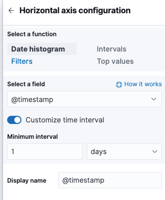
Next, let’s add the @timestamp field for the horizontal axis and customize
the time interval to be one day again.
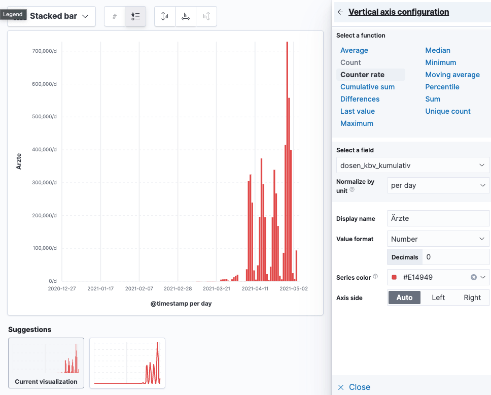
For the vertical axis, select ‘Counter rate’ as function and
dosen_kbv_kumulativ as field. Ensure to set per day as normalize by
unit! I also tweaked the display name and the value format plus the
series color, but that is all optional.
Finally let’s add a similar counter rate field for the dosen_dim_kumulativ
field. Now our graph looks like this
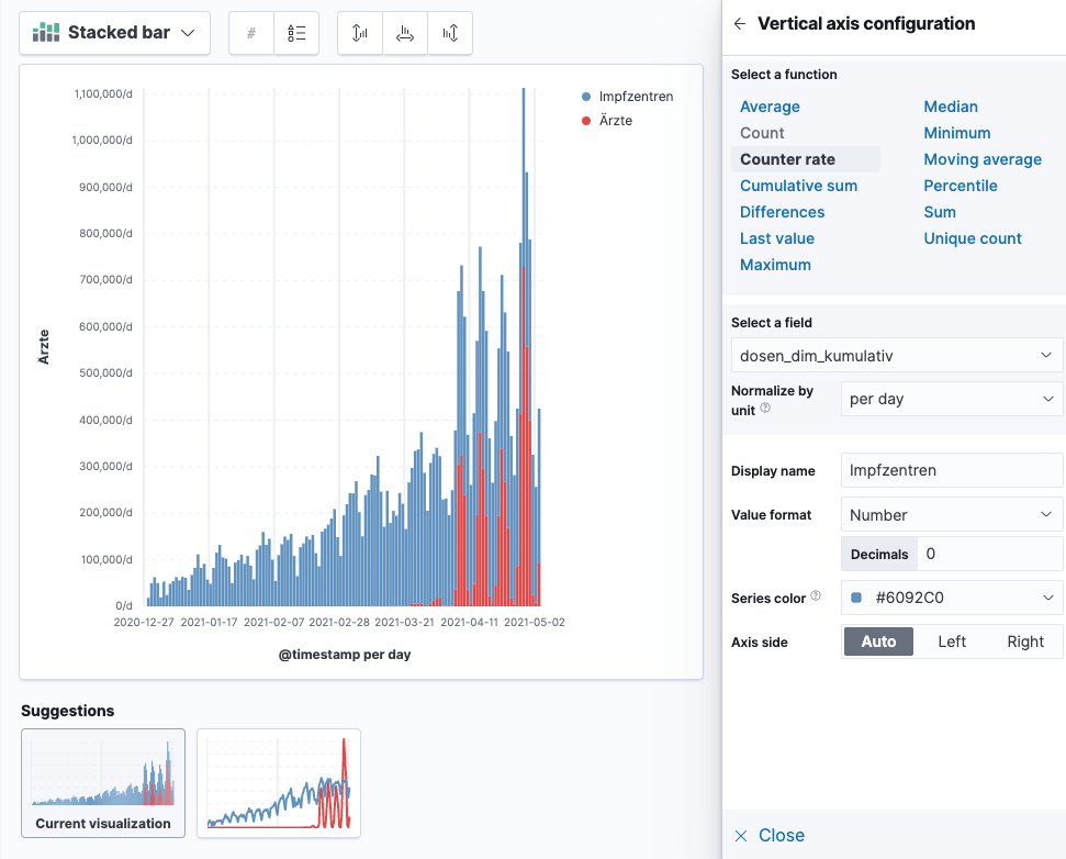
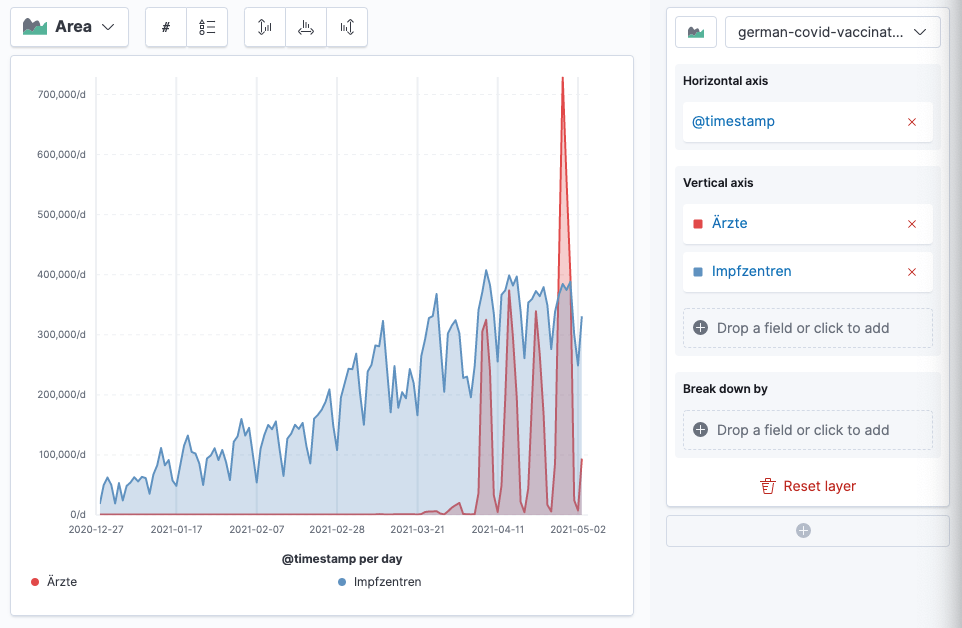
Do you spot the issue? It’s a stacked bar. Luckily this can be easily fixed to be a area chart like this and you can play around with tweaking the axes a little to end up with this chart
OK, we could go on now to replicate some more graphs from the dashboard like the first and total vaccination ratio among the population.
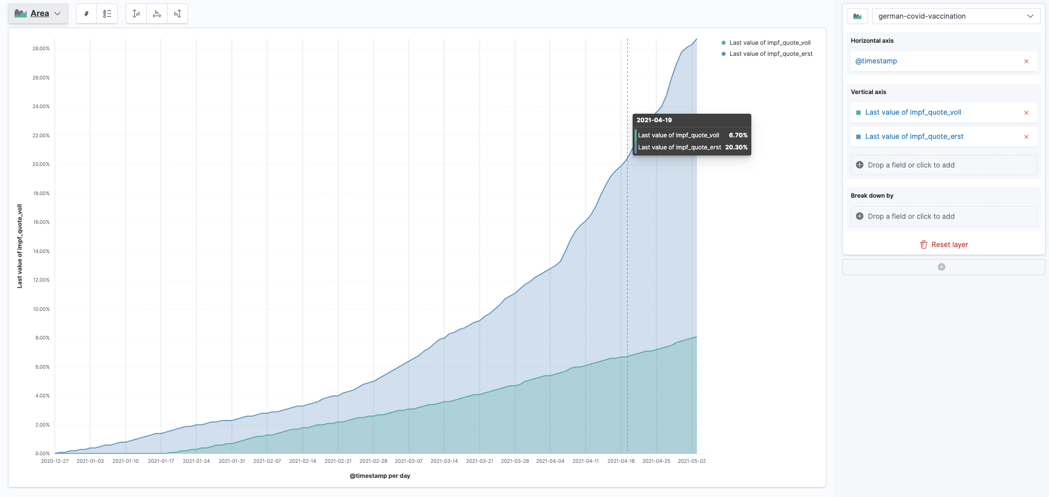
This visualization is based on the impf_quote_erst and impf_quote_voll
fields. You could also visualize based on the vaccine manufacturer.
Also, there are more TSV files in on the impfdashboard website that you could download and visualize on. For now this should be enough.
Summary
- The impfdashboard.de uses TSV files for visualization (they also use Svelte)
- You can download those files and use Kibana’s File Data Visualizer to import them, without needing to do any tweaking
- TSVB used to be the de-facto standard for time series data
- Lens however has become the new standard for all kinds of visualizations and has full support for our use-cases as well, so there is no need for TSVB anymore