 Alexander Reelsen
Awesome Visualizations with Kibana & Vega
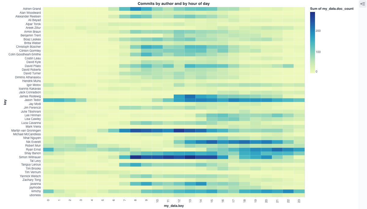
TLDR; This blog post will give a small introduction into Vega visualizations within Kibana in the Elastic Stack. We’ll go step by step to end up with this visualization to see the most productive commit times per author, based on the git repository meta data.
If you prefer to watch this blog post as a video, check it out here (a short nine minute session).
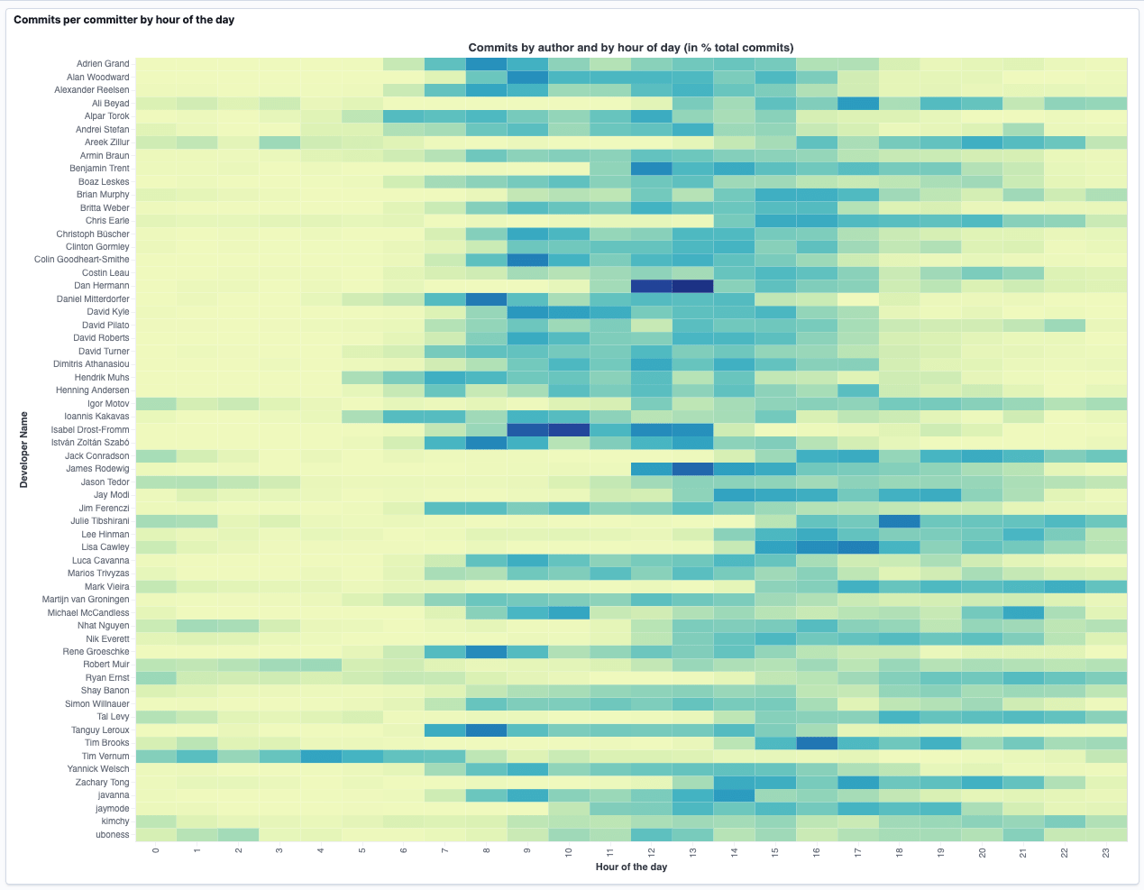
The interesting part of that visualization is, that the commits from each committer are used for the visualization, not the total commits, as otherwise people with longest commit histories would be the only ones with a dense coloring.
We’ll get to this visualization step by step.
What is Vega/Vega-lite?
Before we start, let’s quickly introduce what Vega is:
Vega is a declarative format for creating, saving, and sharing visualization designs. With Vega, visualizations are described in JSON…
That pretty much is all the magic. You describe where your data comes from (that can be any URL), then describe the steps to get it into the proper format - which varies depending on the type of the visualization - and then enjoy that visualization.
Indexing our sample data
For the sample data I picked publicly available data - namely the git repository data from Elasticsearch. If you want to follow along, go ahead and clone the repo via
git clone https://github.com/elastic/elasticsearch.git
After searching around a little bit I could not find a tool, that indexes git data either directly via the GitHub API or from the git repo in a reliable fashion. Properly escaping JSON was something that I missed the most. So I wrote a few lines of Crystal, which I open sourced at spinscale/git-log-to-elasticsearch.
This tool walks through a git repo commit by commit, creates a small in memory structure out of the commit data and after collecting everything, the data is indexed into an Elasticsearch cluster.
A single document looks like this:
{
  "sha" : "1a8b890af576ff1c52627883767f31c0206a982f",
  "repo" : "elastic/elasticsearch",
  "@timestamp" : "2021-06-19T19:30:53Z",
  "branch" : [
    "master"
  ],
  "message" : """Make PIT validation error actionable (#74224)

Cl223""",
  "author" : {
    "name" : "Alexander Reelsen",
    "email" : "alexander@reelsen.net",
    "time" : "2021-06-19T19:30:53Z"
  },
  "committer" : {
    "name" : "GitHub",
    "email" : "noreply@github.com",
    "time" : "2021-06-19T19:30:53Z"
  },
  "files" : {
    "added" : [ ],
    "modified" : [
      "server/src/main/java/org/elasticsearch/rest/action/search/RestSearchAction.java",
      "x-pack/plugin/async-search/qa/security/src/javaRestTest/java/org/elasticsearch/xpack/search/AsyncSearchSecurityIT.java"
    ],
    "deleted" : [ ],
    "all" : [
      "server/src/main/java/org/elasticsearch/rest/action/search/RestSearchAction.java",
      "x-pack/plugin/async-search/qa/security/src/javaRestTest/java/org/elasticsearch/xpack/search/AsyncSearchSecurityIT.java"
    ]
  }
}
Each document contains the commit SHA, the timestamp of the commit, the message and its author as well as the files being changed.
For the rest of this blog post, the most interesting parts are the author
names and the commit timestamp named @timestamp to adhere to the
standard naming convention.
In order to retrieve the top committers we can execute the following query:
GET commits/_search
{
  "size": 0,
  "aggs": {
    "by_author": {
      "terms": {
        "field": "author.name.raw",
        "size": 50
      }
    }
  }
}
This returns the all time top committers, very likely with Simon, Jason and Martijn at the top. As Shay has switched his name at some point in time, he occurs twice in the top 10 instead of being the solely top committer. If we aggregated per email, we could have solved this small data issue.
Now, what we are after however, is the commit frequency per the hour of the day for each committer, let’s come up with a query to do so:
GET commits/_search
{
  "size": 0,
  "aggs": {
    "by_author": {
      "terms": {
        "field": "author.name.raw",
        "size": 50
      },
      "aggs": {
        "by_hour" : {
          "histogram": {
            "field": "hour_of_day",
            "interval": 1,
            "extended_bounds": {
              "min": 0,
              "max": 23
            }
          }
        }
      }
    }
  }
}
The response for each committer looks like this:
{
  ...,
  "aggregations" : {
    "by_author" : {
      "doc_count_error_upper_bound" : 0,
      "sum_other_doc_count" : 11070,
      "buckets" : [
        {
          "key" : "Simon ...",
          "doc_count" : 3182,
          "by_hour" : {
            "buckets" : [
              { "key" : 0.0, "doc_count" : 3 },
              { "key" : 1.0, "doc_count" : 6 },
              { "key" : 2.0, "doc_count" : 0 },
              { "key" : 4.0, "doc_count" : 3 },
              { "key" : 5.0, "doc_count" : 15 },
              { "key" : 6.0, "doc_count" : 40 },
              { "key" : 7.0, "doc_count" : 140 },
              { "key" : 8.0, "doc_count" : 285 },
              { "key" : 9.0, "doc_count" : 245 },
              { "key" : 10.0, "doc_count" : 248 },
              { "key" : 11.0, "doc_count" : 270 },
              ...
This shortened response contains the first bucket of the top committer,
and within that bucket there are 24 sub buckets in the by_hour structure
representing the committers for each hour of the day.
Stop! How does this work, the original JSON did not contain a
hour_of_the_day field, so where does this come from? Well, the original
JSON contained the @timestamp, and one can infer the hour of the day
from that.
If you do not want to that at index time, which in this case would probably be the best solution, this can be done at query using runtime fields.
The definition of this runtime field is part of the mapping, that gets created and looks like this:
GET commits/_mapping?filter_path=commits.mappings.runtime
returns
{
  "commits" : {
    "mappings" : {
      "runtime" : {
        "hour_of_day" : {
          "type" : "long",
          "script" : {
            "source" : "emit(doc['@timestamp'].value.hour)",
            "lang" : "painless"
          }
        }
      }
    }
  }
}
So, whenever a query with the hour_of_day field is done, no matter if as
part of an aggregation or range filter, then the above script will be
executed for each matching document.
Another way to solve this would be to run a script in an ingest processor pipeline, that extracts the hour of the day in its own field. If you want to change that, then our queries would not need any change at all, which is one of the advantages of runtime fields, compared to something like a scripted aggregation.
Now we have our data per committer per hour of the day, and we need to get to work for our visualizations.
Side note: All timestamps are indexed as UTC, so the hour_of_day is
also indexed as UTC and not based on the timezone as part of the commit.
Kibana Vega
In order to create out first vega visualization, you need to create a new
Custom visualization.
You will be greeted with a standard visualization that runs across all
indices and aggregates based on the @timestamp field. If you want change
the data.url.index field value to commits in order to only show the
commits. You will end up with something like this.
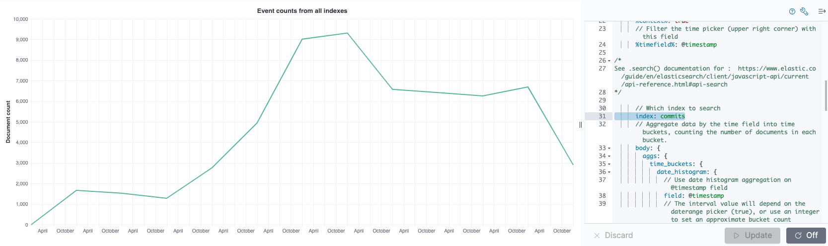
The vega part looks like this when removing all the comments
{
  $schema: https://vega.github.io/schema/vega-lite/v5.json
  title: Event counts from all indexes

  data: {
    url: {
      %context%: true
      %timefield%: @timestamp
      index: commits

      body: {
        aggs: {
          time_buckets: {
            date_histogram: {
              field: @timestamp
              interval: {%autointerval%: true}
              extended_bounds: {
                min: {%timefilter%: "min"}
                max: {%timefilter%: "max"}
              }
              min_doc_count: 0
            }
          }
        }
        size: 0
      }
    }
    format: {property: "aggregations.time_buckets.buckets"}
  }

  mark: line
  encoding: {
    x: {
      field: key
      type: temporal
      axis: {title: false}
    }
    y: {
      field: doc_count
      type: quantitative
      axis: {title: "Document count"}
    }
  }
}
The format of this is HJSON, a JSON dialect allowing for comments as well as not requiring to quote field names or values and you can leave out the comma at the end of a value, before the next one starts. My general advice is to be careful with this power, because I copy pasted some of that code around and ended up with errors. Copy and pasting regular JSON around between Kibana and the Vega editor was no problem for me.
Let’s take a look at the different parts of a vega definition. The data
part contains information where the data is coming from, and in this
concrete example it also contains the information about the Elasticsearch
query and its aggregation. There is one special syntax for the definition of
the %timefield% and setting the %context% to true will apply the
kibana time filter to this visualization, which is very useful. There are a
few special fields using that percent notation. You can read about them in
the Vega reference.
The mark and encoding parts define the expected visualization, in this
case. In this case it is a line visualization plus the definition of the
x-axis being time and the y-axis referring to the document count of the
buckets of the date histogram being returned.
So, how can Vega interpret this? The important magic is in the data
section:
data:
  url:
  ...
  format: {property: "aggregations.time_buckets.buckets"}
The format tells vega to tread each element of the buckets array as a data
row. Within each row the key field is used for the x-axis and the
doc_count field is used for the y-axis.
Now it’s time to get our data up and running here. Let’s try with a first variant like this (you can just copy & paste this into the vega field):
{
  "$schema": "https://vega.github.io/schema/vega-lite/v5.json",
  "title": "Commits by author and by hour of day",
  "data": {
    "url": {
      "%context%": "true",
      "%timefield%": "@timestamp",
      "index": "commits",
      "body": {
        "size": 0,
        "aggs": {
          "by_author": {
            "terms": {
              "field": "author.name.raw",
              "size": 50
            },
            "aggs": {
              "by_hour" : {
                "histogram": {
                  "field": "hour_of_day",
                  "interval": 1,
                  "extended_bounds": {
                    "min": 0,
                    "max": 23
                  }
                }
              }
            }
          }
        }
      }
    },
    "format": {"property": "aggregations.by_author.buckets"}
  },

  "transform": [
    {"flatten" : ["by_hour.buckets"], "as": ["my_data"]}
  ],

  "mark": "rect",

  "encoding": {
    "y": { "field": "my_data.key" },
    "x": { "field": "key" },
    "color": {
      "aggregate": "sum",
      "field" : "my_data.doc_count",
      "type": "quantitative"
    }
  }
}
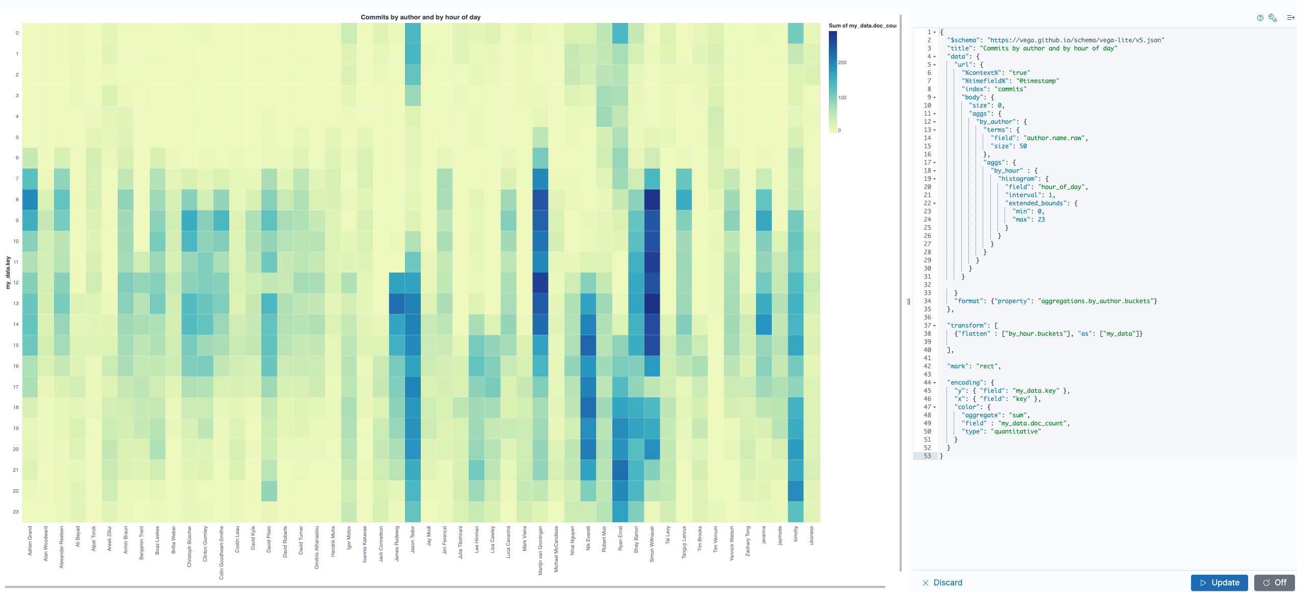
Let’s dissect this. The data.url part looks very similar to
before, just with the aggregation that was created earlier containing all
the hours of the day for each committer.
A new part is the transform section using flatten. The reason why this
is needed is, that vega requires us to have data row for each committer
and each hour of the day, but the current data structure is nested due to
the aggregation response format.
We can however visualize this pretty good using the built-in inspection tools.
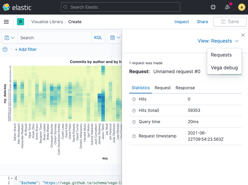
Inspect Vega
When you are within the vega editor you can click on Inspect at the top
and then there is a menu allowing to select Vega debug for the view like
this:
The next view will contain the Data sets tab. Select source_0 and you
will see a list like this:
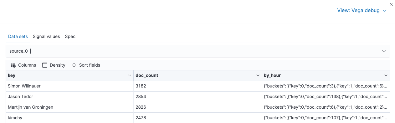
Before transforming data, there is one row per committer, with the
embedded object containing all the hours. Now select data_0, which is
the data after the transformation, and you will see something like this
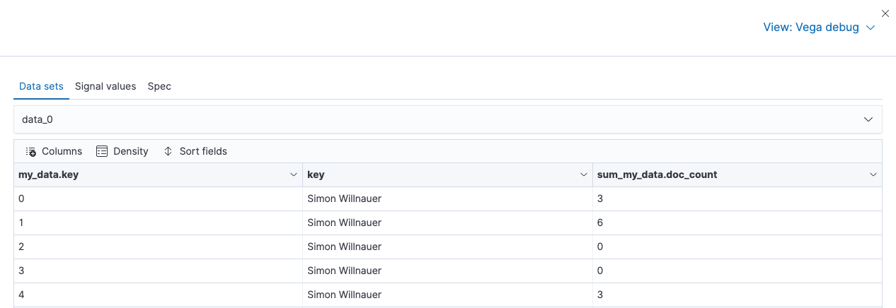
Now this is what we want! Each hour for each committer contains a data
point. The first row means, that in UTC hour zero of the each day, Simon
did a total of 3 commits - that sounds realistic as that is usually 1am
for Simon’s timezone. That also explain the low number of commits in the
following few hours. Now in vega you can refer to the field names via
my_data.key (from the flatten operation), key for the author name
and my_data.doc_count for the commits from each developer.
One more thing you can take a look at is the Spec tab in the Vega debug
window. Clicking on this will not only show you a JSON document containing
your query, but also the response within that document and default
configuration options. So this is all you need to visualize your data
outside of Kibana.
Rotate x and y axis for better readability
Let’s gradually improve our visualization. First switching the x and
y axis will make this visualization more readable.
Now this makes the names of committers more readable. But looking at the data, there is a weakness of how we display data. For each author we are comparing the number of commits with the maximum number of commits of the most committing person. So, every developer who has been around for a long time like Martijn, Jason or Simon will look more busy. This is not a good or informative graph.
Let’s fix this to figure out the most productive hours for each developers based on the developer commits and not the total ones.
Get true per committer stats
In order to get true developer stats, we need to compare the commits per
hour with the total commits of the developer. This basically requires a
calculation to divide current commits by total commits within the scope of
the developer. Luckily, vega has a calculate transform, that we can
utilize.
"transform": [
  { "flatten" : ["by_hour.buckets"], "as": ["my_data"]}
  { "calculate" : "100*datum.my_data.doc_count/datum.doc_count",
    "as" : "relative_calc"}
],
The calculation divides the document count for the current hour by the
document count of the number of commits of this author, ending up with a
relative percentage of how many commits were done in that hour. The
datum field is the way to access the data from the current row, which
means the order of flatten and calculate is crucial in the transform.
Now the last step is to use the relative_calc field in the encoding
section and add labels as a drive-by improvement
"encoding": {
  "x": { "field": "my_data.key", "axis": { "title": "Hour of the day" } },
  "y": { "field": "key", "axis": { "title": "Developer Name" } },
  "color": {
    "aggregate": "sum",
    "field" : "relative_calc",
    "type": "quantitative", "legend":{"title":"% of commits"}
  }
}
Now this makes much more sense! Let’s take a look at the graph
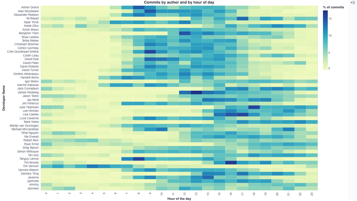
As you can see now each committer has a nice row of commits, which makes it very easy to spot when a committer is most active. Take a look at the third row from the top, which is me and clearly I used to commit most of my code from 8am till 5pm - which makes perfect, as I usually start at 9am my time until 6pm, as I am based in Germany.
There is one last thing we can add, and that is tool-tips in order to get proper information, when you hover the mouse over one of the rectangles.
Add tooltips
Vega tooltips look like this in Kibana:
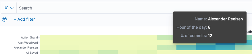
In order to get the tooltips formatted the way we want, let’s add them to
the encoding section
"encoding": {
  "x": { "field": "my_data.key", "axis": { "title": "Hour of the day" }},
  "y": { "field": "key", "axis": { "title": "Developer Name" } },
  "color": {
    "aggregate": "sum",
    "field" : "relative_calc",
    "type": "quantitative",
    "legend": null
  },
  "tooltip": [
    { "field": "key", "type": "nominal", "title":"Name"},
    { "field": "my_data.key", "type": "quantitative", "title":"Hour of the day"},
    { "field": "relative_calc", "type": "quantitative",
      "title":"% of commits", "formatType":"number", "format":"d"
    }
  ]
}
There is also one minor change to set the encoding.color.legend field to
null, so that the legend is not displayed next to visualization as it is
not really helpful to me.
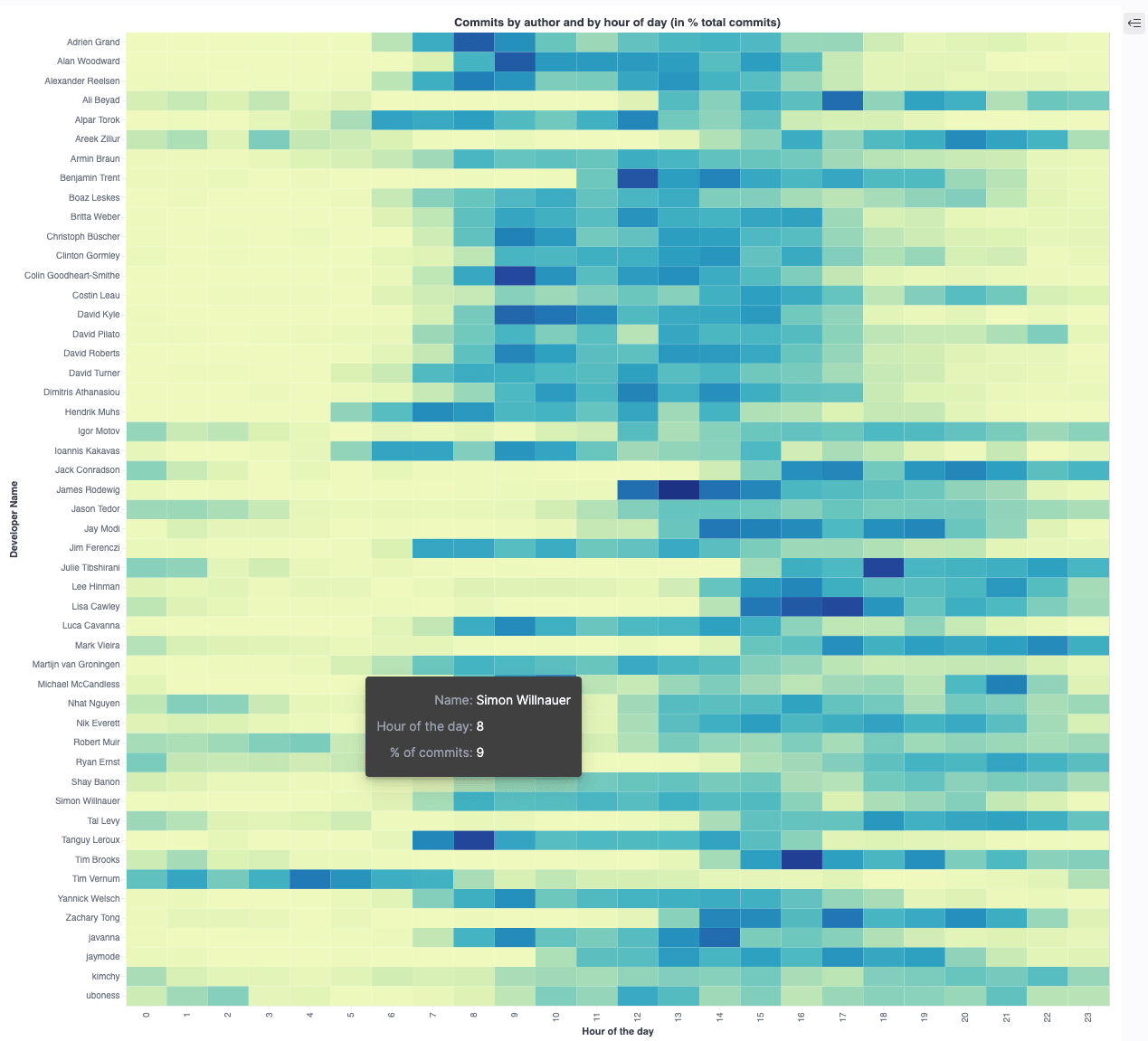
The final visualization JSON
This is the final JSON
{
  "$schema": "https://vega.github.io/schema/vega-lite/v5.json",
  "title": "Commits by author and by hour of day (in % total commits)",
  "data": {
    "url": {
      "%context%": true
      "%timefield%": "@timestamp"
      "index": "commits"
      "body": {
        "size": 0,
        "aggs": {
          "by_author": {
            "terms": {
              "field": "author.name.raw",
              "size": 50
            },
            "aggs": {
              "by_hour" : {
                "histogram": {
                  "field": "hour_of_day",
                  "interval": 1,
                  "extended_bounds": {
                    "min": 0,
                    "max": 23
                  }
                }
              }
            }
          }
        }
      }
    },
    "format": {"property": "aggregations.by_author.buckets"}
  }

  "transform": [
    { "flatten" : ["by_hour.buckets"], "as": ["my_data"]}
    { "calculate" : "100*datum.my_data.doc_count/datum.doc_count",
      "as" : "relative_calc"}
  ],

  "mark": {"type": "rect", "tooltip":true },

  "encoding": {
    "x": { "field": "my_data.key", "axis": { "title": "Hour of the day" }},
    "y": { "field": "key", "axis": { "title": "Developer Name" } },
    "color": {
      "aggregate": "sum",
      "field" : "relative_calc",
      "type": "quantitative",
      "legend":null
    },
    "tooltip": [
      { "field": "key", "type": "nominal", "title":"Name"},
      { "field": "my_data.key", "type": "quantitative",
        "title":"Hour of the day"},
      { "field": "relative_calc", "type": "quantitative",
        "title":"% of commits", "formatType":"number", "format":"d"
      }
    ]
  }
}
and this is the final visualization
Quiz: Can you spot the APAC based developer? :-)
Other use cases
From a vega perspective this has just barely scratched the surface as there are dozens of other visualizations to pick from. From a data perspective an interesting next candidate could be to figure out which files are changed most often together and visualize that. If you used the GitHub API to gather data (instead of the git repository like in this example) it might be interesting which person approves the most pull requests from other persons in order to find bus factors in your own team. The visualization for that would be a sankey visualization. We are using that one internally to visualize another approval process in one of our internal applications (this makes it easy to figure out, if one person keeps approving only one other person):
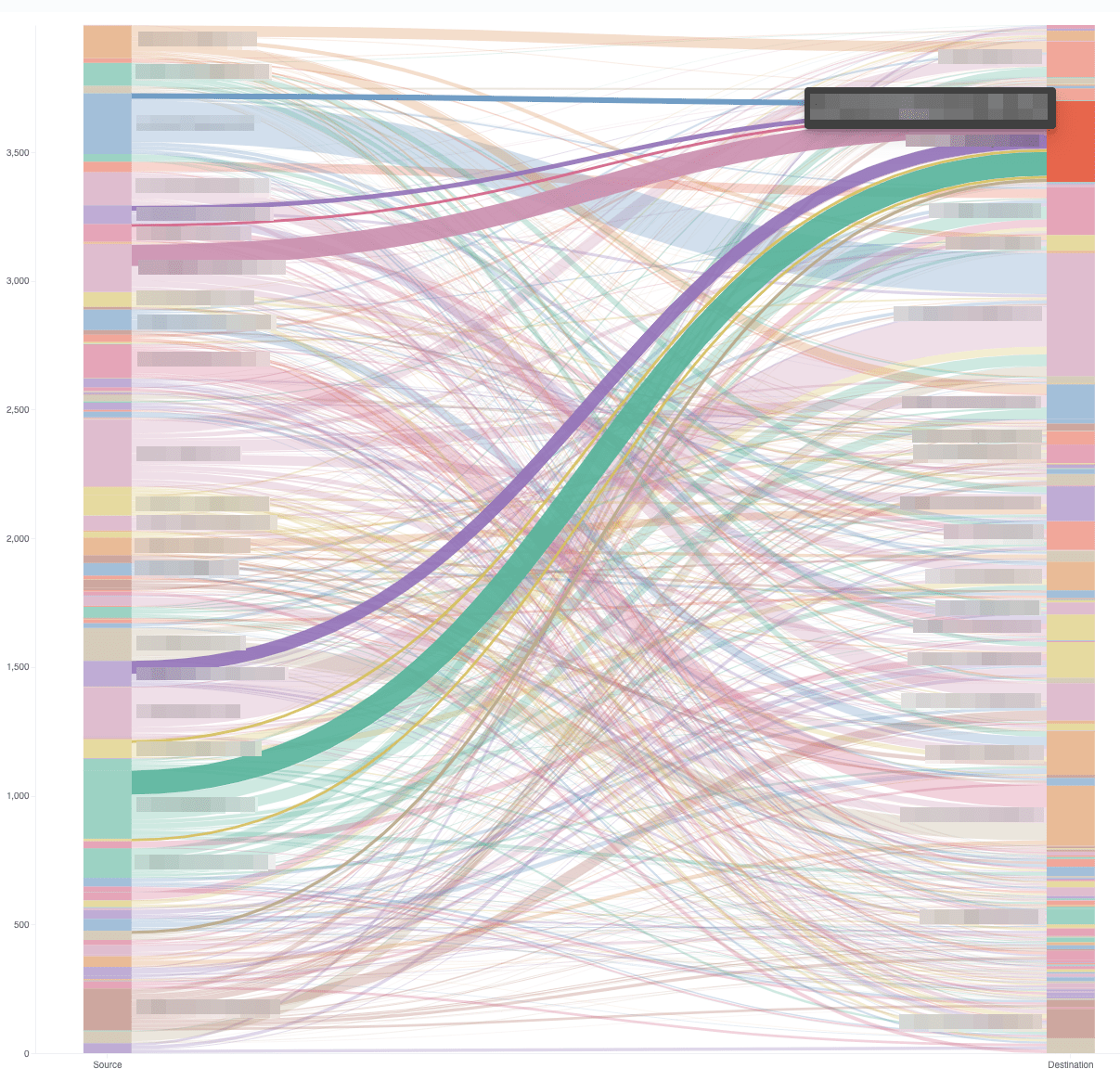
This visualization uses a composite aggregation and thus looks very different than the vega description shown in this blog post. If you want to know more about this, check out this blog post.
Summary
I hope you liked the ride across. Just to reiterate, there is so much more you can do, apart from different visualizations there are also way more transforms to get your data in shape.
Again, check out all the vega examples on the vega website and have fun visualizing!
Resources
- Vega website
- Getting Started with Vega Visualizations in Kibana
- Vega Kibana documentation
- Sankey visualization with Vega in Kibana
- Vega 2D Histogram Heatmap visualization
- Add flexibility to your data science with inference pipeline aggregations
- Kibana Custom Graphs with Vega
- Kibana Scatter Plot Chart via Vega
- git-log-to-elasticsearch
- This blog post as a nine minute YouTube video
Final remarks
If you made it down here, wooow! Thanks for sticking with me. You can follow or ping me on twitter, GitHub or reach me via Email (just to tell me, you read this whole thing :-).
If there is anything to correct, drop me a note, and I am happy to do so and append to this post!
Same applies for questions. If you have question, go ahead and ask!
If you want me to speak about this, drop me an email!