 Alexander Reelsen
A year of solar & power monitoring using Jupyter and DuckDB
TLDR; This blog post takes a look at one year of collected solar cell/power consumption data using Crystal, shell scripts, Jupyter, matplotlib and a little bit of DuckDB.
If you just care for the graphs, jump to this part.
Minor note: I do use kw/h and kwh interchangeably - I know strictly
speaking it is not 😀.
Polling the API
I am having an AlphaESS solar setup (inverter, battery, car charger). There already is a nice app, also used to control the different charger settings like using only solar power, solar + battery or regular charging and seeing realtime data. Luckily over the last year there was an API added under open.alphaess.com as well as a GitHub repository for discussion.
The API requires to send the generated App ID and the current timestamp plus the SHA 512 digest of the app id, the timestamp and the app secret, which can then be compared on the API side. Looks like this in crystal
appId = "alpha12345dd4v532d432"
appSecret = "63409753684b5437534b95073453adg4"
timestamp = Time.utc.to_unix.to_s

data = appId + appSecret + timestamp
digest = Digest::SHA512.digest(data)

headers = HTTP::Headers{
  "appId" => appId,
  "timeStamp" => timestamp,
  "sign" => digest.hexstring
}

…

sysSn = "efheroig23r2fds2e2"
date = Time.utc.at_beginning_of_day - 1.day
queryDate = date.to_s("%Y-%m-%d")
params = URI::Params.encode({"queryDate" => queryDate, "sysSn" => sysSn})
url = "https://openapi.alphaess.com/api/getOneDayPowerBySn?#{params}"
response = HTTP::Client.get url, headers: headers
There are two relevant API endpoints. First the getOneDateEnergyBySn that
provides a high level summary of a day in JSON like this:
{
  "code": 200,
  "msg": "Success",
  "expMsg": null,
  "data": {
    "sysSn": "my_sys_sn",
    "theDate": "2023-11-10",
    "eCharge": 3.90,
    "epv": 6.20,
    "eOutput": 0.21,
    "eInput": 1.41,
    "eGridCharge": 0.10,
    "eDischarge": 7.40,
    "eChargingPile": 0.00
  }
}
The data part contains information about total consumption, consumption
from the grid, solar generation, pushing into the grid and charging.
If you need more details, there is the getOneDayPowerBySn endpoint. This
one contains information per day in 5 minute intervals like this
{
  "code": 200,
  "msg": "Success",
  "expMsg": null,
  "data": [
    {
      "sysSn": "my_sys_sn",
      "uploadTime": "2023-11-10 23:55:41",
      "ppv": 0.0,
      "load": 252.0,
      "cbat": 10.4,
      "feedIn": 0,
      "gridCharge": 276.0,
      "pchargingPile": 0
    },
    {
      "sysSn": "my_sys_sn",
      "uploadTime": "2023-11-10 23:50:41",
      "ppv": 0.0,
      "load": 224.0,
      "cbat": 10.4,
      "feedIn": 0,
      "gridCharge": 244.0,
      "pchargingPile": 0
    },
The above indicates that all the required power came from the grid around midnight.
I created a small crystal snippet that polls for a date, stores
the HTTP response in data/getOneDayPowerBySn-2023-11-10.json or
data/getOneDateEnergyBySn-2023-11-10.json depending on the endpoint polled
and then is doing that until it is caught up with the latest day to
not create gaps when I have not polled for the last few days.
In order to not overload the systems (and previously had been stricter rate limits in place) I also wait 30s between HTTP requests.
JSON is nice, but CSV is easier to consume, time to convert.
Converting to CSV
#!/bin/bash

set -e
shopt -s extglob

for year in 2022 2023 ; do
  if compgen -G "data/getOneDateEnergyBySn-$year*" > /dev/null; then
    file=data/csv-getOneDateEnergyBySn-$year.csv
    (
      echo "sysSn,date,eCharge,epv,eOutput,eInput,eGridCharge,eDischarge,eChargingPile"
      for i in data/getOneDateEnergyBySn-$year* ; do
        cat $i | jq -r '.data | [.sysSn, .theDate, .eCharge,.epv,.eOutput,.eInput,.eGridCharge,.eDischarge,.eChargingPile] | @csv' | tr -d '"'
      done
    ) > $file
    echo "Created $file"
  fi

  for month in 01 02 03 04 05 06 07 08 09 10 11 12 ; do
    if compgen -G "data/getOneDateEnergyBySn-$year-$month*" > /dev/null; then
      file=data/csv-getOneDayPowerBySn-$year-$month.csv
      (
        echo "sysSn,date,ppv,load,cbat,feedIn,gridCharge,pchargingPile"
        for i in data/getOneDayPowerBySn-$year-$month-*.json ; do
          cat $i | jq -r '.data[] | [.sysSn, .uploadTime, .ppv, .load, .cbat, .feedIn, .gridCharge, .pchargingPile ] | @csv' | tr -d '"' | sort -u
        done
      ) > $file
      echo "Created $file"
    fi
  done
done
The core of this magic is the jq call, that converts JSON to
CSV.
After running this script I end up with files like this in the data
directory
❯ ls data/csv-getOneDa* -1
data/csv-getOneDateEnergyBySn-2022.csv
data/csv-getOneDateEnergyBySn-2023.csv
data/csv-getOneDayPowerBySn-2022-11.csv
data/csv-getOneDayPowerBySn-2022-12.csv
data/csv-getOneDayPowerBySn-2023-01.csv
data/csv-getOneDayPowerBySn-2023-02.csv
data/csv-getOneDayPowerBySn-2023-03.csv
data/csv-getOneDayPowerBySn-2023-04.csv
data/csv-getOneDayPowerBySn-2023-05.csv
data/csv-getOneDayPowerBySn-2023-06.csv
data/csv-getOneDayPowerBySn-2023-07.csv
data/csv-getOneDayPowerBySn-2023-08.csv
data/csv-getOneDayPowerBySn-2023-09.csv
data/csv-getOneDayPowerBySn-2023-10.csv
data/csv-getOneDayPowerBySn-2023-11.csv
❯ wc -l data/csv-getOneDa*
      59 data/csv-getOneDateEnergyBySn-2022.csv
     315 data/csv-getOneDateEnergyBySn-2023.csv
    8067 data/csv-getOneDayPowerBySn-2022-11.csv
    9285 data/csv-getOneDayPowerBySn-2022-12.csv
    9049 data/csv-getOneDayPowerBySn-2023-01.csv
    8065 data/csv-getOneDayPowerBySn-2023-02.csv
    8946 data/csv-getOneDayPowerBySn-2023-03.csv
    8649 data/csv-getOneDayPowerBySn-2023-04.csv
   10414 data/csv-getOneDayPowerBySn-2023-05.csv
    8655 data/csv-getOneDayPowerBySn-2023-06.csv
    8934 data/csv-getOneDayPowerBySn-2023-07.csv
    8936 data/csv-getOneDayPowerBySn-2023-08.csv
    8644 data/csv-getOneDayPowerBySn-2023-09.csv
    8965 data/csv-getOneDayPowerBySn-2023-10.csv
    2881 data/csv-getOneDayPowerBySn-2023-11.csv
  109864 total
May 2023 was some sort of data glitch, as the original data contained duplicates as well as suddenly 1 minute granularity instead of 5 minute granularity.
It’s a rather small dataset with a little over 100k entries for all the 5 minute windows. There is no need for high power analytics. I decided to go with DuckDB as I only used it once before, and I thought using Jupyter allows me to create some fancy graphs.
Setting up the python environment
Setting up a Jupyter environment was the most complex task. At least on a M1 notebook…
Using pipenv did not work because some numpy compilation error kept happening.
Preslav Rachev helped me out a
little and hinted I should try with poetry. I installed pipx via brew,
used pipx to install poetry and then used poetry to start Jupyter.
Those are the dependencies that worked for me (sounds a lot like these are the numbers I used to win the lottery):
[tool.poetry.dependencies]
python = ">=3.9,<3.13"
duckdb = "^0.9.1"
notebook = "^7.0.6"
jupysql = "^0.10.2"
pandas = "^2.1.2"
duckdb-engine = "^0.9.2"
matplotlib = "^3.8.1"
With that I started Jupyter and could finally start working on my notebook. Using this snippet to setup
import duckdb
import pandas as pd
import matplotlib.pyplot as plt
import numpy as np

%load_ext sql
conn = duckdb.connect()
%sql conn --alias duckdb

%config SqlMagic.autopandas = True
%config SqlMagic.feedback = False
%config SqlMagic.displaycon = False
Due to JupySQL one can have SQL snippets in Jupyter like this, which are automatically converted into a data frame as configured above:
%%sql
SELECT * FROM read_csv_auto('../data/csv-getOneDateEnergyBySn-*');
I was lazy and decided to not persist anything in DuckDB, but keep reading from the CSV files. This is super slow and still fast enough for my use-case. Thank you DuckDB!
Finally… the stats!
All right, let’s check charging stats over the year:
%%sql --save loading_by_month --no-execute
SELECT strftime(date, '%-y-%m') as yearMonth, sum(eCharge) as kwh
FROM read_csv_auto('../data/csv-getOneDateEnergyBySn-*')
GROUP BY yearMonth
ORDER BY yearmonth DESC;
Using the --save part, the result of that query is stored in
loading_by_month to be reused in %sqlplot to draw a
basic image like this:
%sqlplot bar --table loading_by_month --column yearMonth kwh --orient h
resulting in
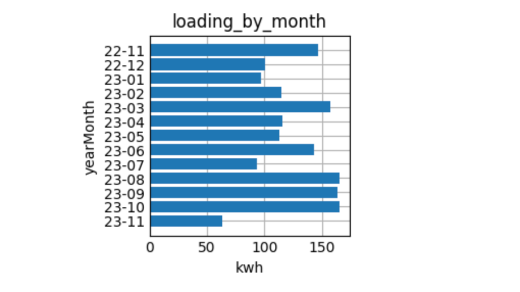
Ok, there is no pattern, how boring.
Let’s figure out, when the earliest solar production of the day started:
%%sql
WITH by_hour AS (
    SELECT
      strftime(date, '%H:%M') as hour_minute,
      date,
      ppv
    FROM read_csv_auto('../data/csv-getOneDayPowerBySn-*')
    WHERE ppv > 0.0
)
SELECT * from by_hour WHERE hour_minute = (SELECT MIN(hour_minute) FROM by_hour) ORDER BY ppv
| hour_minute | date | ppv |
|---|---|---|
| 04:30 | 2023-06-18 04:30:34 | 18.0 |
| 04:30 | 2023-06-24 04:30:47 | 18.0 |
| 04:30 | 2023-06-26 04:30:47 | 18.0 |
| 04:30 | 2023-06-12 04:30:34 | 36.0 |
| 04:30 | 2023-06-13 04:30:34 | 36.0 |
| 04:30 | 2023-06-14 04:30:34 | 36.0 |
| 04:30 | 2023-06-25 04:30:47 | 36.0 |
| 04:30 | 2023-06-17 04:30:34 | 37.0 |
In June the first sun is really coming in at 4:30 in the morning. When was the latest we still had some solar power coming in?
%%sql
WITH by_hour AS (
    SELECT
      strftime(date, '%H:%M') as hour_minute,
      date,
      ppv
    FROM read_csv_auto('../data/csv-getOneDayPowerBySn-*')
    WHERE ppv > 0.0
)
SELECT * from by_hour WHERE hour_minute = (SELECT MAX(hour_minute) FROM by_hour)
| hour_minute | date | ppv |
|---|---|---|
| 22:35 | 2023-06-24 22:35:47 | 18.0 |
As that day is also in the top-10 list above, there was sun production from 4:30 till 22:35, that’s 18 hours. The total production at that day was a little more than 51 kwh (which was not the maximum in a single day).
Let’s do the most common graph by showing the average load per hour:
%%sql avg_load_per_hour <<
SELECT
  date::TIMESTAMP as date,
  load
FROM read_csv_auto('../data/csv-getOneDayPowerBySn-*')
ORDER BY date
with a graph
fig, ax = plt.subplots(figsize=(10, 3))
ax.plot(avg_load_per_hour["date"], avg_load_per_hour["load"], linewidth=2.0)
plt.show()
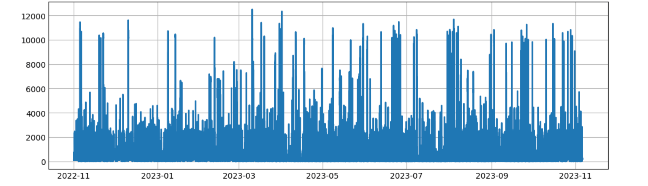
This is not a helpful graph. The peaks may indicate charging a car, but the graph is too dense. We could go with daily granularity and see how the graph looks like
%%sql load_per_day <<
SELECT
  date,
  epv-eOutput+eInput as load
FROM read_csv_auto('../data/csv-getOneDateEnergyBySn-*')
ORDER BY date
fig, ax = plt.subplots(figsize=(10, 3))
ax.plot(load_per_day["date"], load_per_day["load"], linewidth=2.0)
plt.show()
the final image looks like this
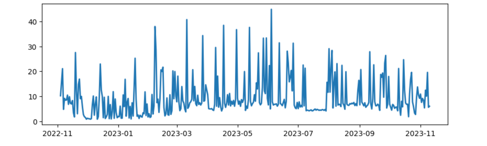
Not sure I get any smarter using this graph. Moving on…
One question I asked myself was if the base power consumption was constant. In order to figure that out I decided to only query the data from 10 PM till 7 AM and check that power consumption.
%%sql avg_load_at_night <<
SELECT DISTINCT
  strftime(date, '%y-%m') as formatted_date,
  AVG(load) OVER (PARTITION BY formatted_date) as load
FROM read_csv_auto('../data/csv-getOneDayPowerBySn-*')
WHERE (date_part('hour', date) >= 22 OR date_part('hour', date) < 7)
ORDER BY formatted_date
Let’s plot it
fig, ax = plt.subplots(figsize=(10, 3))
ax.plot(avg_load_at_night["formatted_date"], avg_load_at_night["load"], linewidth=2.0)
ax.set_ylim(bottom=0)
ax.set_title("Average night consumption from 10pm till 7am")
plt.show()
And the output was
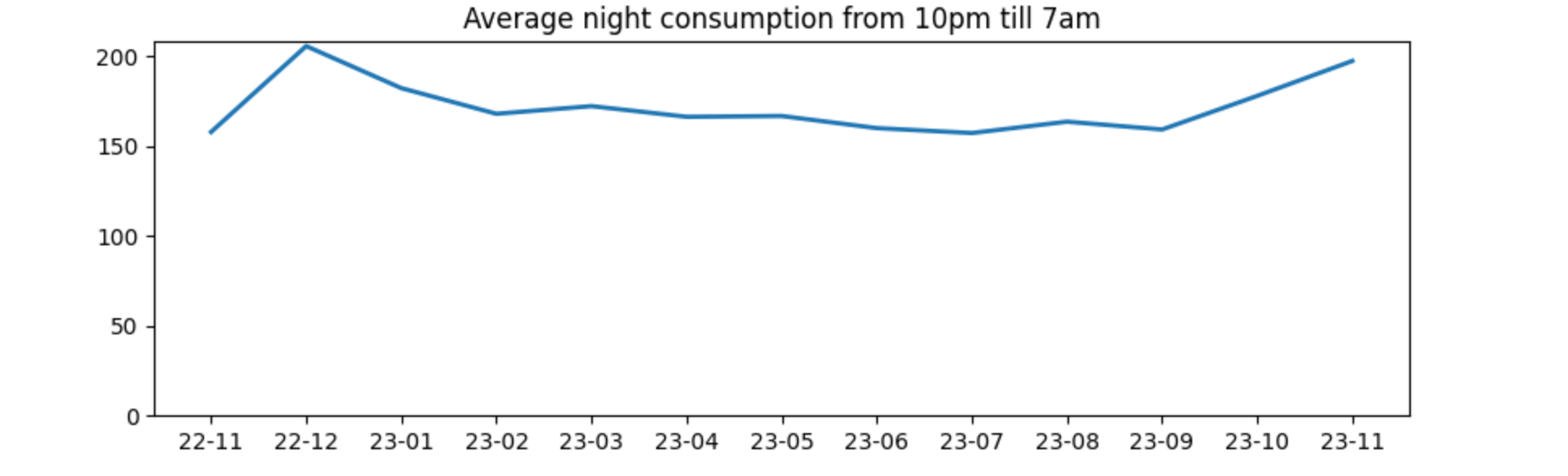
Looks good to me! The required power over time seems to stay constant with all the permanent consumers (fridge, internet & network equipment, outdoor lights, ventilation, etc). With a slight uptick in the winter.
Time for some more general stats like max/min/total/average production per day?
%%sql
SELECT
  max(epv) as max_in_single_day,
  min(epv) as min_in_single_day,
  avg(epv) as average_per_day,
  quantile_cont(epv, 0.5) as median,
  sum(epv) as total_kwh
FROM read_csv_auto('../data/csv-getOneDateEnergyBySn-*')
WHERE epv > 0
| max_in_single_day | min_in_single_day | average_per_day | median | total_kwh |
|---|---|---|---|---|
| 59.0 | 0.8 | 25.8 | 24.15 | 9597.6 |
The total duration of collected data is a little more than a year, but still, impressive numbers! You can also see that there are days with almost no production. How about the average per day per month?
%%sql daily_average_per_month <<
SELECT
  strftime(date, '%y-%m') as year_month,
  avg(epv)::integer as average_per_day,
FROM read_csv_auto('../data/csv-getOneDateEnergyBySn-*')
WHERE epv > 0
GROUP BY year_month
ORDER BY year_month
plotting via
fig, ax = plt.subplots(figsize=(10, 3))
ax.plot(daily_average_per_month["year_month"], daily_average_per_month["average_per_day"], linewidth=2.0)
ax.set_ylim(bottom=0)
ax.set_title("Daily average per month")
plt.show()
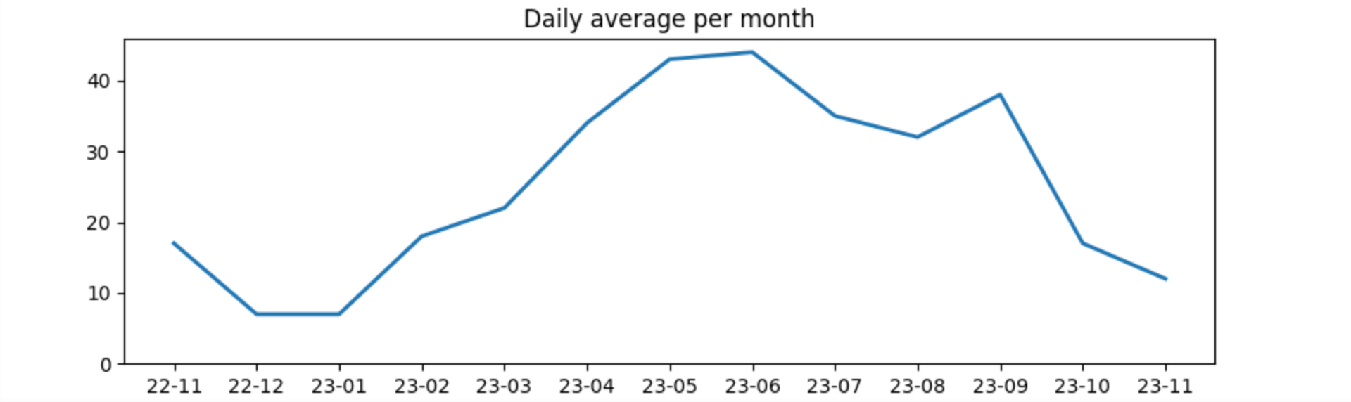
This shows January and December are less than 10kw per day where as May and June exceed 40 kw per day in solar production.
Now, let’s go fancy and combine the solar produce at the hour of day across each month. First a proper query:
%%sql avg_by_month_by_hour <<
SELECT
  strftime(date, '%m') as month,
  strftime(date, '%H') as hour,
  AVG(ppv) as ppv
FROM read_csv_auto('../data/csv-getOneDayPowerBySn-*')
GROUP BY month, hour
ORDER BY month,hour ASC;
This returns the data grouped by month and hour like this:
| month | hour | ppv |
|---|---|---|
| 01 | 00 | 0.0 |
| 01 | 01 | 0.0 |
| 01 | 02 | 0.0 |
| 01 | 03 | 0.0 |
| 01 | 04 | 0.0 |
| 01 | 05 | 0.0 |
| 01 | 06 | 0.0 |
| 01 | 07 | 3.0572916666666665 |
| 01 | 08 | 48.10120481927711 |
| 01 | 09 | 215.20095693779905 |
These first ten results lines indicate that in January there is no sun till 7 AM, and then it is running at 3 watt hours (not kwh) as low as possible. For comparison, when running
avg_by_month_by_hour.query('month == "06"')
For the same hour of the day, there is a produce of more than half a kwh already.
In order to generate a heat map like graph with each month as a row and each hour as a column, the data structure needs to be changed - by creating a pivot table like this
pivot_avg_by_month_by_hour = avg_by_month_by_hour.pivot_table(index='month',columns='hour',values='ppv')
The output of this is a table with 12 rows and 24 columns. Now the last step to create a heat map out of this:
hour_of_day = np.arange(0, 24)
month = ["Jan", "Feb", "Mar", "Apr", "May", "Jun", "Jul", "Aug", "Sep", "Oct", "Nov", "Dec"]

fig, ax = plt.subplots(figsize=(12, 6))
im = ax.imshow(pivot_avg_by_month_by_hour, cmap="YlOrRd")

# Show all ticks and label them with the respective list entries
ax.set_xticks(np.arange(len(hour_of_day)), labels=hour_of_day)
ax.set_yticks(np.arange(len(month)), labels=month)

# Rotate the tick labels and set their alignment.
plt.setp(ax.get_xticklabels(), rotation=45, ha="right", rotation_mode="anchor")

# Loop over data dimensions and create text annotations.
for i in range(len(hour_of_day)):
    for j in range(len(month)):
        text = "{:4.0f}".format(pivot_avg_by_month_by_hour["{:02d}".format(i)]["{:02d}".format(j+1)])
        ax.text(i, j, text, ha="center", va="center", color="black")

ax.set_title("Average produce per month at hour of day")
fig.tight_layout()
plt.show()
resulting in this heat map:
This shows a couple of interesting tidbits. First, as this is a south facing installation, the peak around noon is pretty natural. Second, during winter (January and December) there are only 7 or 8 hours per day with an hourly average produce of more than 0.1 kw/h, whereas in June that was 15 hours per day, twice as much. Third, August was a bit more rainy in our part of Germany this year and it shows in the data as well.
Now, let’s check the amount of power needed from the grid.
%%sql consumed_from_grid_per_day <<
SELECT
  distinct(strftime('%y-%m', date)) as year_month,
  sum(eInput) as consumed_from_grid,
  sum(eOutput) as fed_into_grid
FROM read_csv_auto('../data/csv-getOneDateEnergyBySn-*')
GROUP BY year_month
ORDER BY year_month
and draw it via
fig, ax = plt.subplots(figsize=(10, 3))
ax.plot(consumed_from_grid_per_day["year_month"], consumed_from_grid_per_day["consumed_from_grid"], linewidth=2.0)
ax.set_ylim(bottom=0)
sum = consumed_from_grid_per_day.["consumed_from_grid"].sum()
ax.set_title("Power per month from grid, total {:.2f} kwh".format(sum))
plt.show()
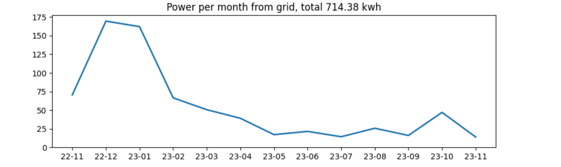
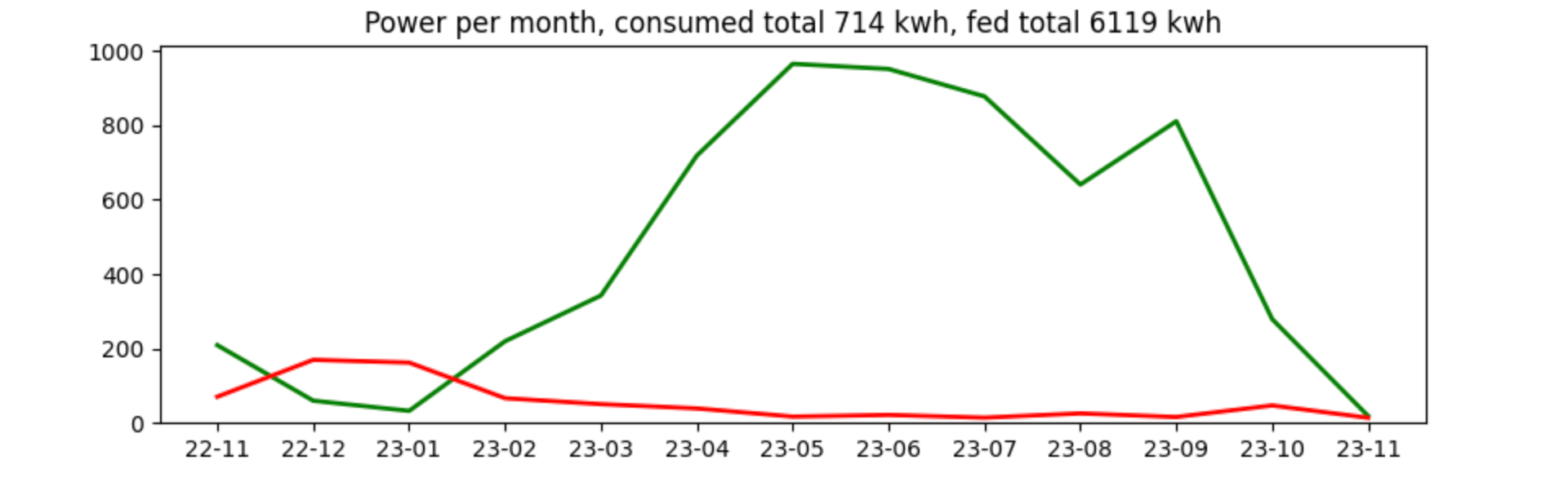
Power consumption in general is not super high in our household, even the winter consumption felt ok to me. We can overlay this with the feed-in, and see that there is no surprise:
fig, ax = plt.subplots(figsize=(10, 3))
ax.plot(consumed_from_grid_per_day["year_month"], consumed_from_grid_per_day["fed_into_grid"], linewidth=2.0, color="green")
ax.plot(consumed_from_grid_per_day["year_month"], consumed_from_grid_per_day["consumed_from_grid"], linewidth=2.0, color="red")
ax.set_ylim(bottom=0)
sum_consumed = consumed_from_grid_per_day["consumed_from_grid"].sum()
sum_fed = consumed_from_grid_per_day["fed_into_grid"].sum()
ax.set_title("Power per month, consumed total {:.0f} kwh, fed total {:.0f} kwh".format(sum_consumed, sum_fed))
plt.show()
Before concluding this post, I still want to find out, how much money was saved. First, let’s figure out, how much of the time we ran on battery.
WITH data as (SELECT
  date,
  CASE WHEN cbat > 10.4 THEN 0 ELSE 1 END AS required_grid_power,
  CASE WHEN cbat > 10.4 THEN 1 ELSE 0 END AS ran_on_battery
FROM read_csv_auto('../data/csv-getOneDayPowerBySn-*')
)
SELECT
  SUM(required_grid_power) as count_on_grid,
  SUM(ran_on_battery) as count_on_battery,
  count_on_battery/(count_on_grid+count_on_battery)*100 as pct_on_battery
FROM data
| count_on_grid | count_on_battery | pct_on_battery |
|---|---|---|
| 14588 | 94889 | 86.6748266759228 |
86% of the time the battery was used. In case you are wondering about the 10.4 above, that’s the minimum configured capacity of the battery.
This still does not give a proper indication of costs, as one does not know the required power when the battery was not used.
For this amount of time there was a static pay per kw/h that was fed in, that amount is quick to calculate:
SELECT
  sum(eOutput)*0.082 as eur_feeding_to_grid
FROM read_csv_auto('../data/csv-getOneDateEnergyBySn-*')
That resulted in roughly 500 EUR for feeding in, which is pretty frustrating, as pushing a single kwh makes you 8.2 euro cents, but retrieving a kwh from the grid was almost seven times as much as that (until we switched power supply companies). Let’s take our power costs into account and calculate for each kw/h that we produced and consumed ourselves, how much was saved:
%%sql money_earned <<
WITH consumption AS (
SELECT
  date,
  CASE WHEN date >= make_date(2023, 11, 1)
       THEN sum(epv-eOutput)*0.NEW_PRICE
       ELSE sum(epv-eOutput)*0.OLD_PRICE
  END as eur_saved_due_to_consumption,
  sum(eOutput)*0.082 as eur_feeding_to_grid
FROM read_csv_auto('../data/csv-getOneDateEnergyBySn-*')
GROUP BY date
ORDER BY date
)
SELECT
  strftime(date, '%y-%m') as formatted_date,
  sum(eur_saved_due_to_consumption+eur_feeding_to_grid) as sum_total
FROM consumption
GROUP BY formatted_date
ORDER BY formatted_date
fig, ax = plt.subplots(figsize=(10, 3))
ax.plot(money_earned["formatted_date"], money_earned["sum_total"], linewidth=2.0)
ax.set_ylim(bottom=0)
ax.set_title("Money saved per month".format(sum))
plt.show()
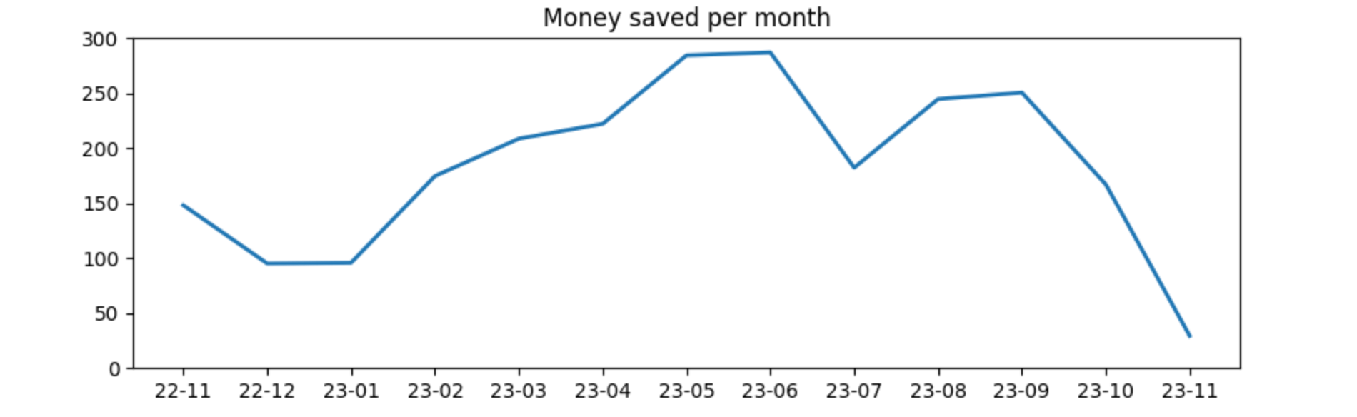
The above mentioned high costs per kw/h consumed is the reason for the high savings here. We recently switched to Octopus Energy (note, that’s an affiliate link, should you decide to switch as well 😀 and I’d save some money on future bills) for power and gas as prices were half of previous prices when we decided to switch. From first of November this year, the amount of money saved will be much lower due to a much lower price to pay per kw/h.
One last thing: autarky. To me it was interesting how much power is still needed from the grid. Let’s take a look
%%sql autarky <<
SELECT
  date,
  round((1-eInput/(epv-eOutput+eInput))*100, 2) as autarky_pct
FROM read_csv_auto('../data/csv-getOneDateEnergyBySn-*')
fig, ax = plt.subplots(figsize=(10, 3))
ax.plot(autarky["date"], autarky["autarky_pct"], linewidth=1.0)
ax.set_ylim(bottom=0)
sum = autarky["autarky_pct"].mean()
ax.set_title("Autarky per day in %, avg {:.2f}%".format(sum))
plt.show()
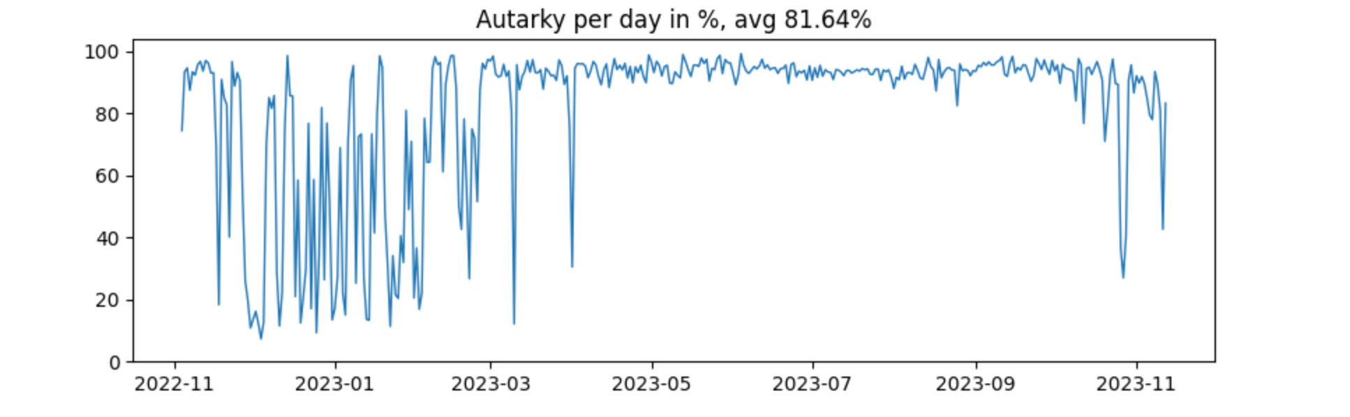
The six months during and around summer are pretty much fed by solar. From November till March there is much more variance, as now this is highly dependent on the sun filling up the battery. In December 2022 there were a couple of really cloudy days in a row.
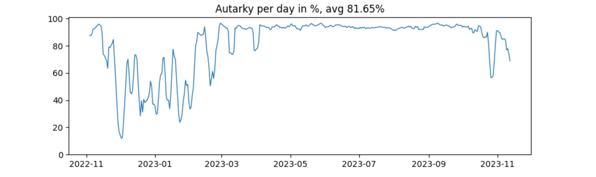
Adding some windowing, by taking the next and previous day into the average calculation smoothes the graph out a little like this:
%%sql autarky <<
SELECT
  date,
  avg(round((1-eInput/(epv-eOutput+eInput))*100, 2)) OVER (
        ROWS BETWEEN 2 PRECEDING
                 AND 2 FOLLOWING) as autarky_pct
FROM read_csv_auto('../data/csv-getOneDateEnergyBySn-*')
Now the graph is a little easier to look at the expense of losing some granularity
Summary
As power prices normalized in 2023 in Germany and are at 2021 costs again, switching to solar might not save a lot of money in the future. Being able to power our home for the majority of the year by itself is pretty nice from my perspective, as well as charging the car almost for free in the summer.
I’m also not sure if I consider that setup an investment from an economic perspective as I have no idea if it will repay itself within a decade, but I more likely consider it an ecological investment to have my home powered on renewable energy. I think the climate catastrophe will be the biggest issue my and the next generation face in the coming decades. Hope to help a little (and yes, I know it needs solutions from the a political angle much more, let’s not go there in this post) - and yet it looks pretty bleak to me.
Now, what is next? Well, there another API endpoint allowing to query data more real-time, that could be used to dynamically turn on or off heating/cooling devices across the house using HomeAssistant or similar tools, when enough power is produced or the battery is full, but for now nothing is planned.
Also, I don’t have any major statistics experience, so if you think I totally screwed up a graph or calculation, please give me a ping.
Resources
- Overview from Michael Simons about his solar installation and data collection, which was a heavy inspiration :-) content is in German
- Similar blog post from Oli Thissen about a year of PV (in German as well!)
- DuckDB in Action, an upcoming book about DuckDB, that you can read already on manning as a livebook
- DuckDB documentation
- Solaranzeige, an Open Source project to have a proper dashboard for many different inverters using a Raspberry Pi
Final remarks
If you made it down here, wooow! Thanks for sticking with me. You can follow or contact me on twitter, GitHub or reach me via Email (just to tell me, you read this whole thing :-).
If there is anything to correct, drop me a note, and I am happy to fix and append a note to this post!
Same applies for questions. If you have question, go ahead and ask!
If you want me to speak about this, drop me an email!