 Alexander Reelsen
Solar power monitoring with Elasticsearch and ES|QL
TLDR; This post explains how I used ES|QL with my three years of data of my photovoltaic installation and how easy it was to write the queries and create a dashboard.
Two years ago I used Jupyter and DuckDB for the same task, but time to try something different. If you want to know more about the setup and polling the data, read that previous blog post.
Importing CSV data into Elasticsearch
I have a cronjob that downloads the latest data via API in JSON format and automatically creates two CSV files - one with daily data and one with five minute intervals. As you guessed right, the big file has about 350k entries, so we’re slightly short as a big data use case - maybe if someone sponsors me a few thousand more installations to monitor 😂
Getting the time zones right
The first problem I ran into with the CSV import was the fact, that the dates in the CSV did not have a timezone, but Kibana tried to be smart and simply assumed the browser timezone instead of UTC. This messed up queries for the five minute intervals as suddenly a query for 1:30 am was happening before midnight.
The solution: Change the date processor in the import to assume a timezone like this:
"date": {
  "field": "date",
  "timezone": "UTC",
  "formats": [
    "yyyy-MM-dd HH:mm:ss"
  ]
}
After doing two imports, one for solar-daily for the daily data and one
for solar-five-mins with a live snapshot from every 5 minutes, we see the
following data structure for the daily data:
{
  "@timestamp": "2022-11-03T23:00:00.000Z",
  "date": "2022-11-04T00:00:00.000Z",
  "eCharge": 8.7,
  "eChargingPile": 0,
  "eDischarge": 4.2,
  "eGridCharge": 0.9,
  "eInput": 3.5,
  "eOutput": 4.1,
  "epv": 14.3,
  "sysSn": "ALB123456789000"
}
And this is what the five minute data looks like:
{
  "@timestamp": "2025-08-10T22:58:43.000Z",
  "cbat": 100,
  "date": "2025-08-10T22:58:43.000Z",
  "feedIn": 0,
  "gridCharge": 4,
  "load": 232,
  "pchargingPile": 0,
  "ppv": 0,
  "sysSn": "ALB123456789000"
}
Field names are slightly different, but as the data is used for different queries that is not much of a problem.
Let’s dig into the data!
Queries - Overview
Initial start
To see if my data is correct, we can start with a simple count
FROM solar-five-mins | STATS COUNT(*)
This returns around 320k entries. Another check would be to check for the
number of distinct sysSn fields, which should be one, as I this is a
unique identifier for any installation.
FROM solar-daily | STATS COUNT_DISTINCT(sysSn)
Unsurprisingly this returns 1.
Queries - Charging
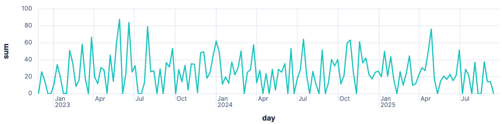
How often do I charge my car
Next up, let’s take a look how often the car is charged.
FROM solar-daily | STATS sum = SUM(eChargingPile) BY day = BUCKET(date, 1 week)
As we don’t use our car for commuting there is no real consistency in this graph.
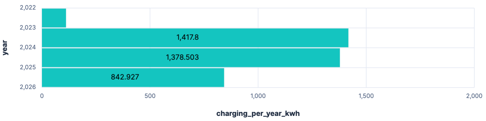
Charging per year
How much am I charging per year? My first try was the following query
FROM solar-daily | STATS charging_per_year_kwh = SUM(eChargingPile) BY year = BUCKET(date, 1 year)
However, when trying to display this in a bar chart I always got the full timestamp displayed, which took to much space, so I reduced it to the year via the query, as I could not find a formatting option.
FROM solar-daily
  | EVAL year = DATE_EXTRACT("YEAR", date)
  | STATS charging_per_year_kwh = SUM(eChargingPile) BY year
Queries - Pushing into the grid
Usage vs. pushing into the grid
As in Germany retrieving power is currently four times more expensive than pushing into the grid, it makes sense to optimize a lot for own consumption and that is probably the main angle to calculate the dimension of a photovoltaic system.
So, let’s check on that:
FROM solar-daily | STATS SUM(eOutput), SUM(epv), SUM(eOutput)/SUM(epv)*100
Result is the following:

So around 64% of the produced power are pushed into the grid. 10000 kw/h are consumed ourselves. We will dive later on better metrics for checking load.
Queries - Load
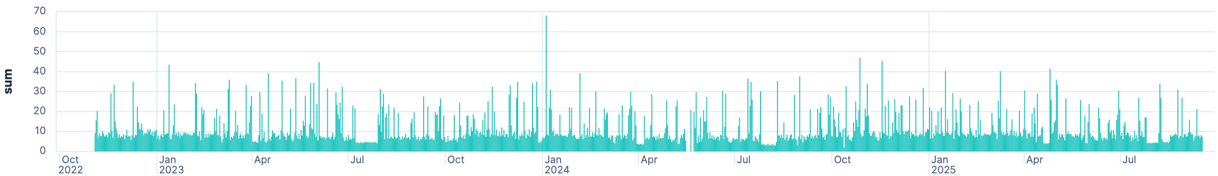
Daily Load
Let’s figure out the daily load
FROM solar-daily | STATS SUM(epv + eInput + eDischarge - eCharge - eOutput) BY day = BUCKET(@timestamp, 1 day)
When running this query, it is capped after a little less than three years
of data and it took me a while to figure out why: there is a default LIMIT 1000 added to every query - and it is clearly written out in the Discover
console, I just missed it. Increasing that limit worked manually.
So running
FROM solar-daily
  | STATS sum = SUM(epv + eInput + eDischarge - eCharge - eOutput) BY day = BUCKET(@timestamp, 1 day)
  | LIMIT 2000
return the following graph
Daily load without charging car
Turns out that including the charger load leads to outliers, because charging the car requires always more power than any other consumption. To understand the consumption from our home, we need to exclude the charging like this:
FROM solar-daily
  | STATS sum = SUM(epv + eInput + eDischarge - eCharge - eOutput - eChargingPile)
    BY day = BUCKET(@timestamp, 1 day)
  | LIMIT 2000
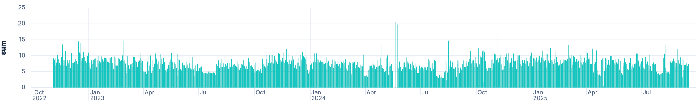
This is a good reason why you should not put any such data live into the internet. It’s easy to spot when you’re not at home, and it’s easy to spot when I run a pyrolysis in the oven 😀 Also you can spot data errors, as there are days with no load and then much higher load after that, that do not make sense. In my case it’s actually not that simple, as I was sometimes travelling and thus not working from home also changes the consumption drastically, even though the rest of the family is at home in the afternoon and at night.
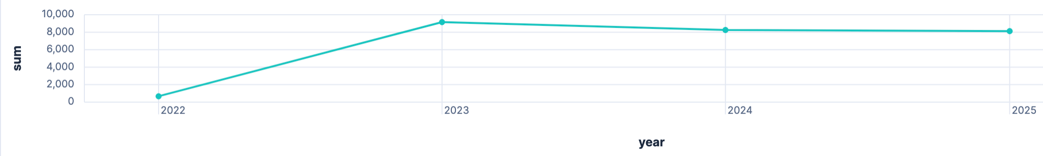
Load per year
The load resembles the total amount of power needed per year. This does not resemble how much power was needed from the grid, but does include charging the car.
FROM solar-daily
  | STATS sum = SUM(epv + eInput + eDischarge - eCharge - eOutput) BY year = BUCKET(@timestamp, 1 year)
Base load at night
Another thing I was curious about: Did my base load increase over the years. My assumption is that this is the case, because you keep adding electronic devices, not just the fridge and ventilation, but networking equipment, outdoor lights with sensors, home automation, etc. If you don’t have big consumers running at night, then that could be a good time window for the base load:
FROM solar-five-mins
 | WHERE DATE_EXTRACT("HOUR_OF_DAY", date) >= 23 OR DATE_EXTRACT("HOUR_OF_DAY", date) <= 5
 | STATS AVG(load) BY month = BUCKET(date, 1 month)
There is indeed s slight increase of the average over the years. Some components, probably the heating seems to need an additional amount of power, when the outdoor temperatures are lower.
Queries - PV Production
Total production
Next up, let’s check how much solar energy has been produced in total:
FROM solar-daily | STATS SUM(epv)
This ends up with roughly 26000 kw/h since first measurement. We can also configure a dedicated field name for the summarized field like this:
FROM solar-daily | STATS produced_kwh = SUM(epv)
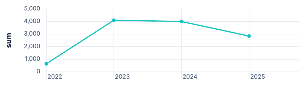
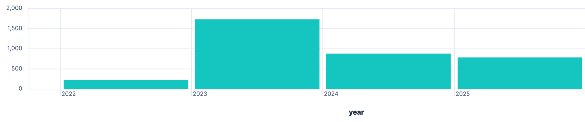
Total production per year
Let’s go into more detail and see if we can come up with the yearly production
FROM solar-daily | STATS sum = SUM(epv) BY year = BUCKET(date, 1 year)
This creates a dataset/table like this:
| sum | year |
|---|---|
| 670.9 | Jan 1, 2022 @ 00:00:00.000 |
| 9,159.3 | Jan 1, 2023 @ 00:00:00.000 |
| 8,258.1 | Jan 1, 2024 @ 00:00:00.000 |
| 8,123.6 | Jan 1, 2025 @ 00:00:00.000 |
While the data makes sense (PV got installed in late 2022, so not much produce that year), the formatting of the year is not ideal, as I am not interested in a full timestamp here. However when moving away from the timestamp to group manually like this
FROM solar-daily
  | EVAL year = DATE_EXTRACT("YEAR", date)
  | STATS sum = SUM(epv) BY year
It’s a bit harder to create charts, as those often assume the timestamp on the x-axis.
If you want to display a year only in a table, you can configure the table to show that value as a number with no decimals. A line graph looks like this:
As this data is from before October 2025, it’s obvious that solar production in 2025 was a lot better than in 2024.
Total production per week
Let’s break this down a little more and show stats on weekly base:
FROM solar-daily | STATS sum = SUM(epv) BY week = BUCKET(date, 1 week)
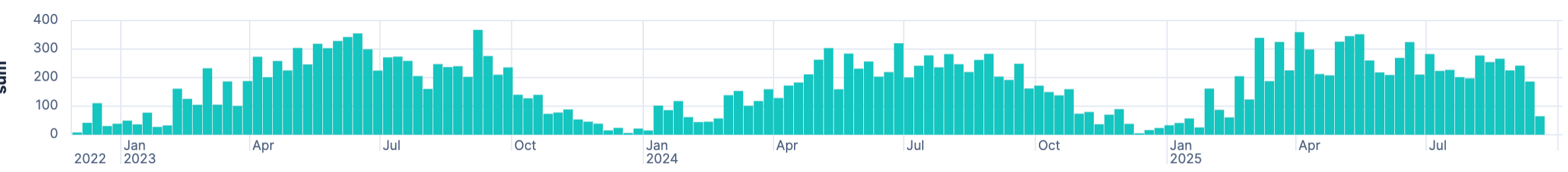
Well, turns out, there’s a peak in summer and a slump in winter…
So, maybe it’s more interesting to overlay each year in a line graph instead.
FROM solar-daily
  | EVAL year = DATE_EXTRACT("YEAR", date), week_of_year = DATE_EXTRACT("ALIGNED_WEEK_OF_YEAR", date)
  | STATS sum = SUM(epv) BY week_of_year,year
The trick is to configure the three values right in a line diagram for horizontal and vertical axis, plus breakdown like this:
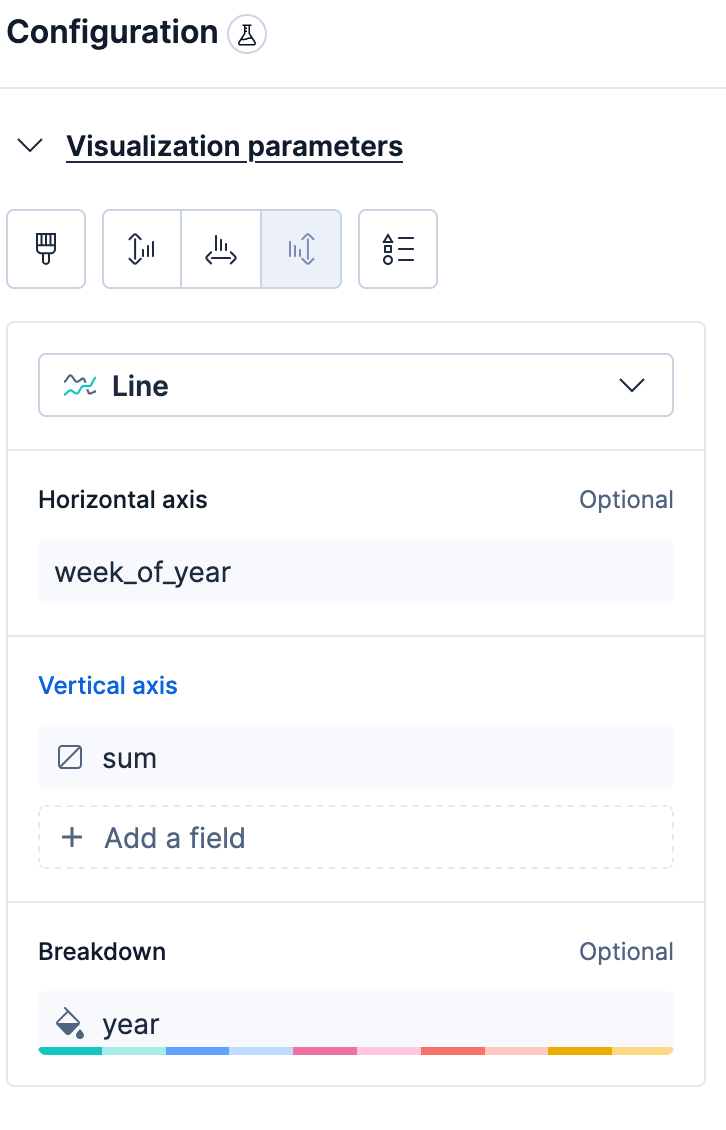
This will result in an image like this:
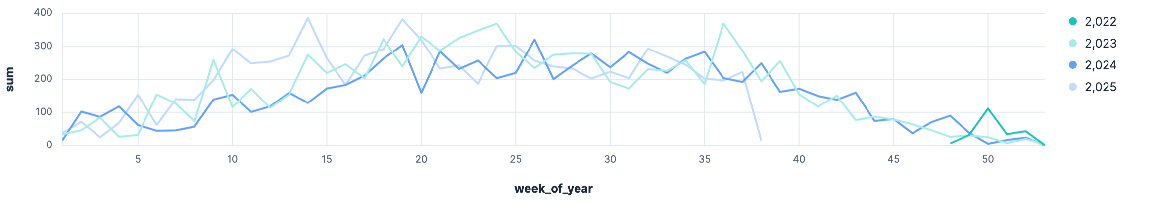
And 2025 was really a strong spring this year.
Earliest solar production
So far we only looked at the daily production, but what can we do with the five minute data? Quite a bit. One of the things I am curious about is dates of the earliest solar production for each year:
FROM solar-five-mins
    | KEEP ppv,date
    | WHERE ppv > 0
    | EVAL minute_of_day = DATE_EXTRACT("MINUTE_OF_DAY", date)
    | SORT minute_of_day ASC
    | LIMIT 10
I added a minute_of_day field to sort on, which makes this query
relatively simple. Running this shows a clear outlier on my data, because
the first hit is 2024-10-20T01:32:42.000Z and it’s highly unlikely that in
October at night caused the production of 800 w/h except a data issue. The
other first nine hits are all in June 2023, so apparently it was bright
really early in that year?
Latest solar production
FROM solar-five-mins
    | KEEP ppv,date
    | WHERE ppv > 0
    | EVAL minute_of_day = DATE_EXTRACT("MINUTE_OF_DAY", date)
    | SORT minute_of_day DESC
    | LIMIT 10
By changing the sort, we can look at the latest solar production. And again it is all in June 2023, always around 22:30.
With the earliest and latest solar production all in June 2023, I also wonder if there is anything off here. For 2025 it was starting around 5:15 and ending around 21:45. That’s such a major difference that I am not sure about where it comes from, maybe there is an explanation in how the earth rotates around the sun, but I find 90 minutes more in total quite a bit.
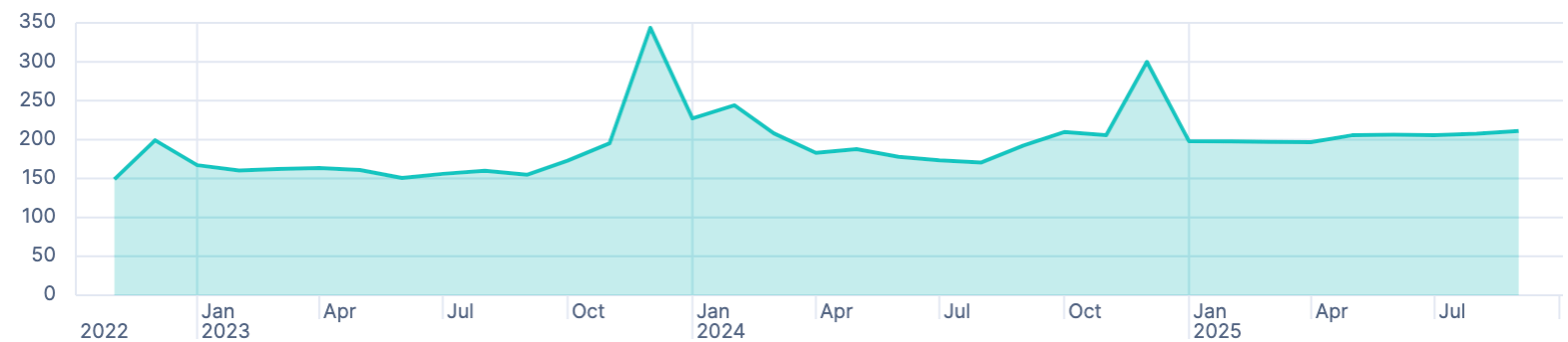
Peak production
Let’s take a look at our peak production - theory vs. practice.
FROM solar-five-mins
  | STATS MAX(ppv) BY month = BUCKET(date, 1 month)
This is a simple stat and it shows a production around 10 kw/h, which impossible, because the amount of solar cells cannot produce that. Don’t always trust your data 😀
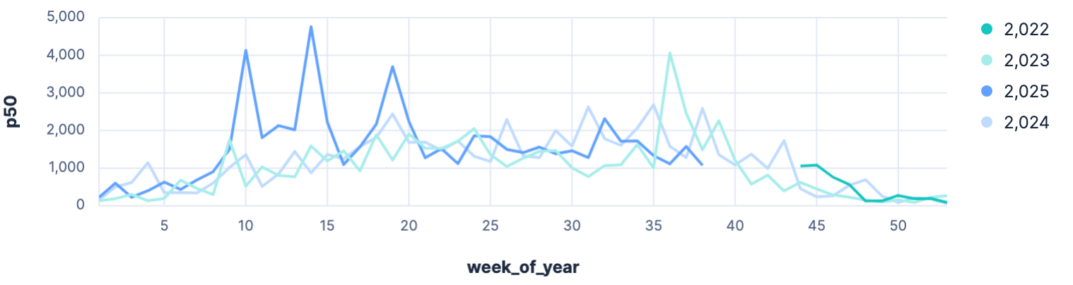
OK, let’s get a percentile per month
FROM solar-five-mins
  | WHERE ppv > 0
  | EVAL year = DATE_EXTRACT("YEAR", date), week_of_year = DATE_EXTRACT("ALIGNED_WEEK_OF_YEAR", date)
  | STATS p50 = PERCENTILE(ppv, 50) BY year, week_of_year
Of course this is not a good example for a p50 percentile, even with the zero production intervals filtered out. But we can clearly see in the graph, that 2025 was a really strong year in the spring
Production daily average
Instead of p50 per five minutes, let’s go back to the average production per day.
FROM solar-daily
  | STATS AVG(epv) BY month = BUCKET(date, 1 day)
  | LIMIT 2000
This shows a clear outlier with over 140 kw/h produced. Another data glitch because a few days in a row had apparently no produce in the data and then a big day hit, which has not happened but shows bad data. We should filter this out and group by week:
FROM solar-daily
  | WHERE epv < 60
  | STATS AVG(epv) BY month = BUCKET(date, 1 week)
  | LIMIT 2000
Alternatively to week grouping, we could also try a sliding window to smooth out the graph a little, but I could not figure out, how to do this with ESQL.
Production per hour of the day
Time to become more fancy now with the diagrams. Let’s go crazy and make a heat map
FROM solar-five-mins
  | WHERE ppv > 0
  | EVAL month_of_year = DATE_EXTRACT("month_of_year", date), hour_of_day = DATE_EXTRACT("HOUR_OF_DAY", date)
  | STATS AVG(ppv) BY month_of_year, hour_of_day
  | SORT hour_of_day ASC, month_of_year ASC
While the data is returned correctly, I was not able to create a nice looking heat map as sorting in two dimensions did not work and one was always randomized. I thought this is a bug in the current implementation and might be fixed after 9.1.3. This is what it looks like
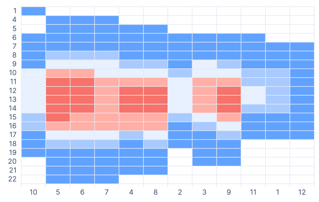
After posting in the forums I understood the problem. Turns out that the
ppv > 0 leaves holes in our data aka NULL values. They are considered
the highest/lowest in sorting by default and screw up the sorting. Instead
removing the WHERE clause and changing the visualization colorization a
little bit returns the expected result.
Queries - Grid
Consumption vs. feeding into the grid
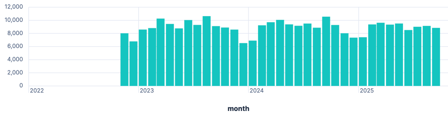
This graph won’t show a lot of surprises other than telling that there is less sun in the winter. Retrieving the amount of kw/h required from the grid graphed with pushing into the grid should reveal, that in the winter, this setup actually needs power unsurprisingly.
FROM solar-daily
 | STATS from_grid = SUM(eInput),
         to_grid = SUM(eOutput),
         load = SUM(epv + eInput + eDischarge - eCharge - eOutput)
   BY month = BUCKET(date, 1 month)
Creating an unstacked area graph, we end with a visualization like this
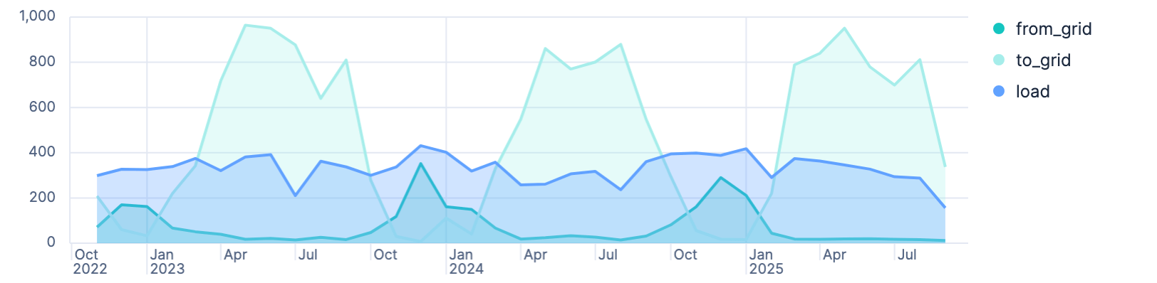
It’s good to see, that December is the month with the most required power, and October the start of the season, where the system does not produce enough power to sustain. You can also see that this year so far the production was so good, that essentially from March on-wards there was no need to get power from the grid.
When the from_grid metric almost touches the load, like in December, then
there was almost no production.
Running on grid power
So, how efficient are we running over a year? How often are needing power from the grid compared to running on battery? Let’s run this query:
FROM solar-five-mins
 | EVAL year = DATE_EXTRACT("YEAR", date),
        required_grid_power = CASE(cbat < 11, 1, 0),
        on_battery = CASE(cbat >= 11, 1, 0)
 | STATS pct_on_grid = ROUND(
     SUM(required_grid_power)/TO_DOUBLE(SUM(on_battery)+SUM(required_grid_power))*100 ,2
   ) BY year
 | SORT year DESC
Which returns a table like this:

As only 2023 and 2024 are full years, those are the only trustful numbers, which are relatively near to each other and make sense.
2022 only started in November and thus cannot be counted, as those were two months with the worst production - however still only 40% of the time required power from the grid as November was quite sunny.
2025 is not yet finished, and there was also an increase in battery capacity, so this number might remain slightly lower. However with the October, November and December missing, the months with the lowest PV production are not included yet, so that percentage is not helpful either.
Battery not fully charged
Let’s figure out on how many days per year the battery did not get charged fully, as those are likely times, where we needed grid power as well.
FROM solar-five-mins
  | EVAL battery_full = CASE(cbat == 100, 1, 0)
  | STATS battery_full = SUM(battery_full) BY date = DATE_TRUNC(1 day, date)
  | WHERE battery_full == 0
  | STATS COUNT_DISTINCT(date)
This returns 272 of 1065 days - which is kinda impressive, that only on 25%
of the days the battery was not fully charged. In general no indication, how
much grid power was needed. If we’re changing the CASE statement to check
for 12% battery, there are still 46 days with basically no power
production - so roughly 15 days per day there is basically no solar power at
all - or not enough to power the house and load the battery.
Queries - Saved costs & Income
Money saved consuming self produced power
FROM solar-daily
  | EVAL factor = CASE(
      @timestamp >= "2023-11-01", 0.3,
      @timestamp >= "2024-11-01", 0.28,
      0.55
    ), money_saved_due_to_consumption = (epv-eOutput)*factor
  | STATS SUM(money_saved_due_to_consumption) BY year = BUCKET(@timestamp, 1 year)
As 2022 was the start of high prices for power and gas, we had a really high price per kw/h when we moved here and only in 2023 we switched to another supplier which basically cut the money we save from self consuming almost in half. This November power price will hike by roughly 10%, so I expect more savings over the course of next year.
As a final step we should combine the amount of money we saved by using produced power plus the amount of money we earned by feeding into the grid.
FROM solar-daily
  | EVAL factor = CASE(
      @timestamp >= "2023-11-01", 0.3,
      @timestamp >= "2024-11-01", 0.28,
      0.55
    ),
    money_saved_due_to_consumption = (epv-eOutput)*factor,
    money_made_feeding_in = eOutput * 0.082
  | STATS money_made_feeding_in = ROUND(SUM(money_made_feeding_in), 2),
          money_saved_due_to_consumption = ROUND(SUM(money_saved_due_to_consumption), 2)
    BY year = BUCKET(@timestamp, 1 year)
  | EVAL year = DATE_FORMAT("yyyy", year)
So even with current relatively low power prices, a decent amount of money is saved per year - however it still will take way more than a decade to become a positive investment - unless we consume way more power ourselves (i.e. by adding air con in the summer), or in case power becomes more expensive. Not sure how much sense it makes to consume more power when a country is still dependent on fossil fuels, but that’s what the current model is advocating for in Germany.
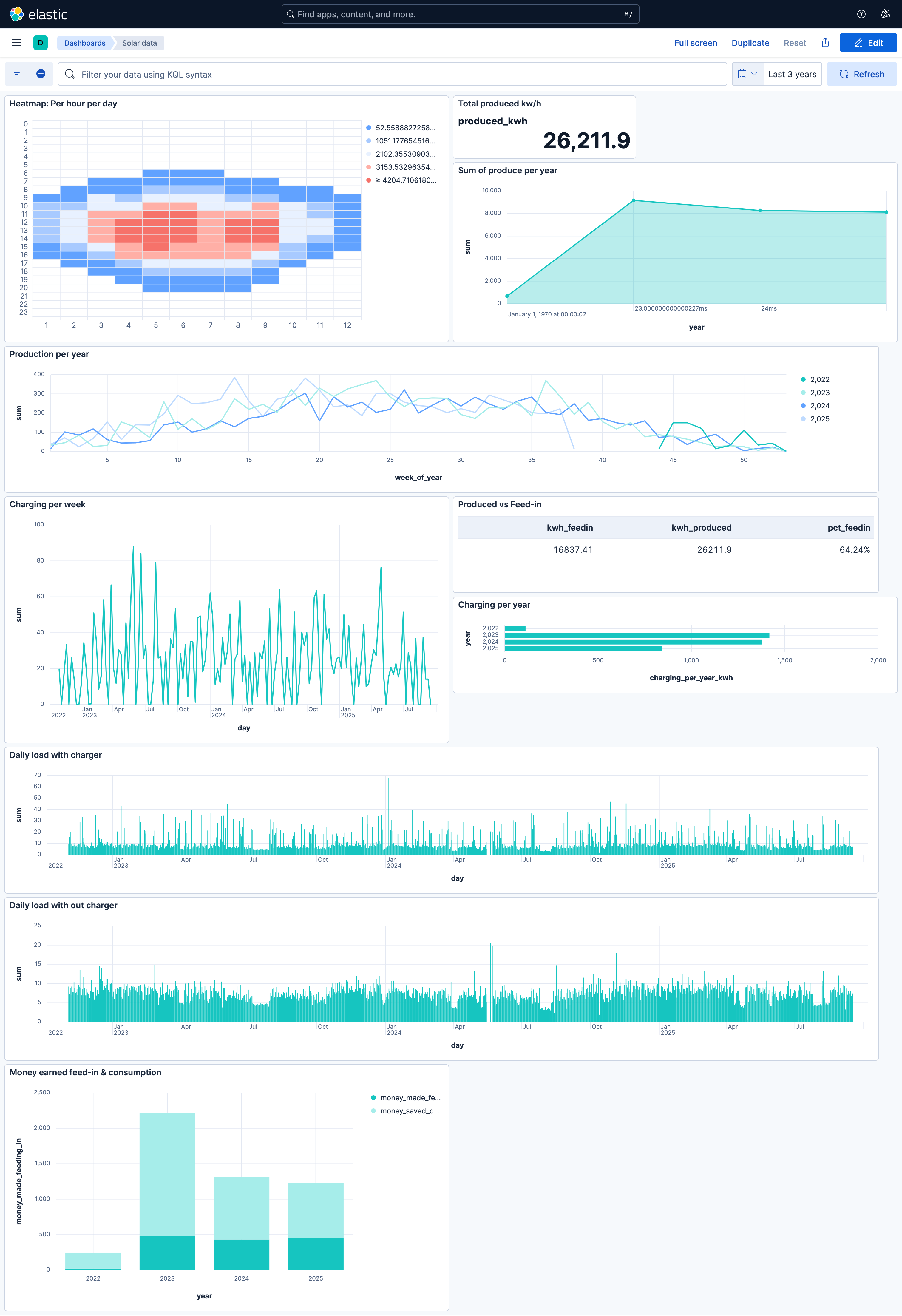
Dashboard
This is the final dashboard
Limitations & Issues
I hit a few limitations, as usual some of them my fault, but worth mentioning.
Time zones
First, time zones. Keep in mind that the browser tries to be smart with data where no timezone could be found on importing. Make sure this matches with what you expect, otherwise all your queries are off - which in this use-case would have been quite bad.
ESQL
As ESQL is still relatively young, I’ll give the benefit of the doubt here. I think there are still functions to be added over time, so I’ll just wait. Most I was missing sliding windows.
Also there are sometimes limitations in the query language, where you work
around a little. For example when trying to retrieve the earliest solar
production I would like to make sure, that for every day there is only one
minimum timestamp. However, I only managed to do that by adding an
additional field that converts the timestamp into minutes of the day and
then use that, because I could not figure out the proper grouping criteria
in combination with the tuple of date and current PV produce. I managed to
this using the query DSL, runtime mappings and the top_hits agg.
GET alphaess-solar/_search
{
  "runtime_mappings": {
    "minute_of_day": {
      "type": "long",
      "script": {
        "source": "emit(doc['@timestamp'].value.toLocalTime().toSecondOfDay())"
      }
    }
  },
  "size": 0,
  "query": {
    "range": {
      "ppv": {
        "gt": 0
      }
    }
  },
  "aggs": {
    "by_day_latest": {
      "terms": {
        "size": 2,
        "field": "@timestamp",
        "order": {
          "max": "desc"
        }
      },
      "aggs": {
        "top_hits": {
          "top_hits": {
            "_source": ["ppv"]
          }
        },
        "max": {
          "max": {
            "field": "minute_of_day"
          }
        }
      }
    }
  }
}
You can judge which of the two is more readable 😀
With regards to time series data I currently find the split between
functions just for time series data not intuitive. Using TS instead of
FROM plus having specific time series aggregation functions that are not
available otherwise.
Kibana Discover
The new ESQL editor is nice, with all the autocomplete features, which work quite well.
What caught me off guard a few times is the default LIMIT 1000, especially
when you look over 4 years of data with daily results you sometimes wonder
why the dataset is not complete. I know there is a warning displayed, but
it’s hard to spot, when you’re working on a visualization.
I am using Firefox and there were times when the browser became painfully slow or the tab was actually stopped by Firefox. Also when you run a weirdly expensive query and you reload I am not sure if the query tries to be rerun, because the tab was hanging often. I could not spot an in-progress indicator. Again, might be that Firefox was the culprit here.
The most pesky thing to me was the fact that a change in the query resets the visualization back to a bar chart. So when you are working on a nice visualization like our heat map, but you decide to change the query or its structure a little, you can start over with a bar chart. This was frustrating as I rarely new the right query upfront, but it’s more about discovery.
Summary
First, I think using ESQL is quite an upgrade for analytics comparing to writing aggregations in the query DSL. It’s not yet complete, but I think it might get there.
It’s a bit rough at some edges, but I like the general approach. I think it’s even simpler than SQL at some cases, but of course lacks the full power of it.
I also learned that the data from the solar API is not a hundred percent correct and with the queries a few of those glitches were relatively easy to spot.
The main question is the main use-case of ESQL. If it’s more into observability, then functions like complex sliding windows/RANK OVER like statements are probably less needed and maybe a simple auto-smoothing function is good enough. We will see…
Final remarks
If you made it down here, wooow! Thanks for sticking with me. You can follow or contact me on Bluesky, Mastodon, GitHub, LinkedIn or reach me via Email (just to tell me, you read this whole thing :-).
If there is anything to correct, drop me a note, and I am happy to fix and append a note to this post!
Same applies for questions. If you have question, go ahead and ask!